
Brand Style Guide · v2.4 · August 2026
Singer Equity & Wellness
A living brand reference
Everything needed to build, design, or extend this site — colors, type, spacing, icons, illustrations, and code. The visual system leads; the details follow.
Six primary brand colors plus two text/utility values. All section backgrounds use these colors as block-level inline styles.
Secondary Palettes
Complementary tonal tints (from the Canva Brand Kit) for backgrounds, section fills, illustration shading, and data/visuals. The primary anchors above remain for logos, buttons, and key UI.
Live render note: global CSS caps headings via clamp — H1 clamp(30px,5vw,40px), H2 clamp(20px (flat, full width)), H3 clamp(15px,1.6vw,16px). The sizes below are the design scale; on-page sizes are the clamped values.
One typeface system: Rubik (sans-serif) across all text — headings and body copy, labels, and UI. Served via Google Fonts.
Logos
The Monolith brand marks. Primary and Secondary logos use stone blue #334656 as the brand anchor. All marks are PNG with transparent backgrounds.
Export: SVG preferred; PNG fallback ~1500px wide (header logo renders at 190×71).

Primary Logo
Witness-monolith mark + wordmark (stacked). Main brand usage.

Secondary Logo
Dolmen/threshold mark + wordmark (stacked). Footer & secondary contexts.

Horizontal Logo
Mark + wordmark in horizontal lockup. Use in site header.
Witness Mark
Standalone witness-monolith icon. Favicon, watermark, small-space use.
Threshold Mark
Standalone threshold/dolmen icon. Pairs with Secondary Logo.
Monograms & Marks
Flexible marks for watermarks, favicons, and pattern use.

Monogram
SW lettermark, transparent

Monogram Monoliths
SW in monolith lockup

Sacred Waymark
Stacked cairn mark
Threshold
Simple threshold mark
White / Reversed (for dark backgrounds)
Use these on slate, stone, or olive backgrounds — e.g., the dark hero overlays, the title-slide of decks, and dark sections.





Everything needed to build, extend, or recreate singerwellness.org. Use the designer/developer toggle throughout each section to reveal technical details.
For Designers
Use this guide for color values, typeface specifications, spacing scale, and visual tone. All hex values are click-to-copy.
For Developers
Toggle developer mode in each section to reveal WordPress block class names, CSS variables, REST API media IDs, and the full custom CSS applied to global styles.
For AI Prompts
The AI Prompts section at the bottom contains copy-paste prompts describing the brand’s visual language, tone, and design system for use in image generation or code tasks.
Keeping It Updated
Open this HTML file in any text editor. Add new assets under the relevant section. New icons, illustrations, or pages should include: name, description, dimensions, and WordPress media ID.
The brand’s name, mission, and voice guide every design and copy decision.
Name
Singer Equity & Wellness
Abbreviation: SEW
Operator: Kris Singer (They/Them)
Mission
LGBTQ+ and TGNC-affirming clinical therapy, training, and community support. Grounded in equity, lived experience, and the CARE Framework.
Voice & Tone
- Warm, direct, and inclusive
- Clinical credibility without jargon
- Gender-expansive, community-first
- Professional but never cold
CARE Framework
Contextual Assessment for Relational Ethics — a proprietary clinical framework developed by Kris Singer for gender-affirming care. Central to the brand’s insights.
Core Values (Brand)
- Witness
Seeing and holding space for another’s full experience without agenda or judgment.
“I’m honored to bear witness to the lives and stories my clients share with me.” - Protector
Advocating for safety, boundaries, and systemic equity in clinical and community spaces.
“I help protect my clients who have always had to do it alone, confronting the conditions that keep putting them at risk.” - Nurturer
Creating conditions for growth, healing, and authentic self-expression.
“I provide a steady presence because I know how much it matters to be cared for by someone who keeps showing up.” - Co-Conspirator
Actively working alongside clients and communities toward liberation and equity.
“Moving beyond passive support, I advocate alongside clients in their battles with oppression.”
Primary CTA
“GET STARTED” — links to /request/ (intake/contact form page). Used site-wide as the primary action button, including in the navigation header.
The written counterpart to the visual rules on this page. Where the rest of the guide covers colour, type, and components, this covers how the brand’s words should sound. Built from Kris’s thesis and the copy Kris wrote or approved, then refined against real drafts, so every example below is an actual correction. Use it for web copy, outreach emails, and decks, and to keep AI-assisted drafts from drifting into brochure language.
At a glance
- Warm, direct, and inclusive
- Clinical credibility without jargon
- Gender-expansive, community-first
- Professional but never cold
The voice in one line
Kris writes like a clinician who has both read the research and lived the reality: direct, structurally aware, and warm through precision rather than sentiment. Sentences are complete and flowing, following a thought all the way through. The writing is personal, it carries an I, and it reads like a calling, never a pitch.
Who is speaking
First person (I / we). The writer is Kris Singer: a queer and trans clinical social worker in New York City, with an MSW and a master’s in women’s history, and fifteen years in corporate digital-marketing leadership before the clinical turn. Radical, spiritual, and in recovery. A lifelong organizer and advocate, out since high school, where they started a GSA.
- Women’s history background gives a structural, historical lens. Kris names the machinery, not just the mood.
- Radical, lifelong advocate means the justice stance is earned, not theoretical. The co-conspirator value is autobiographical.
- Spiritual and in recovery means honest about hard things without wallowing and without false cheer.
- Of service means the work is a calling, never salesy or self-congratulatory.
- Corporate leadership and executive DE&I is the unique positioning: Kris speaks the clinical and the commercial fluently, and built inclusion from inside the C-suite rather than critiquing it from outside. With company audiences the voice can be results-aware and plainspoken about retention, trust, and performance, without losing the clinical grounding.
Warm, but never soft-focus. Serious without being cold. Trusts the reader to feel the weight without being told to.
The clinical lens
Kris’s thinking runs on Self Psychology and attachment theory, with The Four Agreements as a practical tool. Use the concept, not the citation.
- Self Psychology (Kohut). The self is built through relationship: mirroring, idealization, twinship. This is why the copy centres being seen, recognized, and accompanied rather than fixed or solved.
- Attachment theory. Safety is relational, built through consistency, rupture, and repair. This is why steady presence belongs in the voice.
- The Four Agreements (Ruiz). A wisdom-tradition tool held alongside clinical rigour, treating healing as everyday practice.
Bottom line: people are not problems to be solved, they are selves formed and re-formed in relationship.
1. Warmth through truth, not decoration, and it’s personal
Warmth comes from an accurate, specific, often personal observation, not from tender words stacked on top. The strongest version usually carries an I and a real feeling.
✗ Bearing witness to people’s stories with empathy, curiosity, and deep relational care.
✓ I’m honored to bear witness to the lives and stories my clients share with me.
2. Name the system, not just the feeling
The struggles here are structural. Name oppression, the conditions, the machinery, not just the mood around it.
✓ The hardest decisions come when professional ethics conflict with the realities our marginalized clients live.
3. Let sentences follow the thought all the way through
Kris does not speak in punchlines. Do not clip sentences into fragments for effect. Directness is not the same as truncation.
✗ Most ethical training tells us where the line is. It rarely tells us what to do when holding that line.
✓ Most ethical training tells us where the line is, but it rarely tells us what to do when holding that line would cause the very harm we set out to prevent.
4. Trust the reader, understate
Do not tell people how to feel, and do not promise transformation. Evidence and specificity land harder than uplift.
✗ When a young person feels seen, everything else gets more possible.
✓ Research shows one affirming adult measurably raises belonging and lowers depression.
5. Clinical credibility without jargon
Precise and evidence-aware, but plain enough for a caregiver to read. In public copy, use the concept, not the citation.
House rules
- Commas, not em dashes. En dashes only inside number ranges, for example 13–24.
- Flowing, not choppy, but not run-on. Flow through conjunctions and subordinate clauses (“but,” “while,” “when…”), not through stacked comma-appositives.
- One list at most. A colon before a single clean list beats a mid-sentence pile-up.
- First person is welcome. Personal usually beats impersonal.
- Avoid the gerund-list formula. “Bearing witness to x, y, and z” is a tic, not the voice. A gerund leading into a first-person clause is fine.
- Sentence case. Credential is MSW for now.
Red flags, the draft has drifted
- The gerund-plus-list formula. Templated and detached.
- Clipping a sentence into a punchline.
- Sentimental verbs and images: soften, unclench, blossom, journey, the light, hold space as cliché.
- Vague uplift: change everything, everything gets more possible.
- Marketing superlatives, hype, or self-congratulation. This work is service, not a sale.
- Reusing existing placeholder copy and passing it off as new.
- Handing Kris’s own words back as a proposed option. Diff every option against what Kris already said.
- Reusing a line Kris flagged. Flagged text is forbidden to reuse, not locked. “Rewrite” means re-author every clause.
- Telling the reader how to feel.
- Em dashes, run-ons, double comma-lists, or false cheer that skips the hard thing.
Moves and words that are Kris
- “the reality / realities [someone] is living,” “the realities our clients live”
- “the person in front of you,” “the client in front of you”
- “marginalized communities,” “structural,” “the conditions,” “oppression,” “cisheteronormative”
- “bear witness,” “accountable,” “advocacy,” “responsive to,” “grounded in,” “of service,” “scholarship”
- Grounds care in scholarship, not only feeling. The academic training is a voice asset, not something to hide.
- Often makes the values the active agent (“they promise…,” “they inspired…”) rather than always centering “I built.”
Each pair names the trap so it is catchable. This is a living list. Every time a line gets corrected, add it here.
| Drifted | Kris |
|---|---|
| 1. The “words / script” trap The point is never the right thing to say, it is safety, being seen, showing up. | |
| ✗ Your next words matter. | ✓ Whether they feel safe next is up to you. |
| ✗ I help families find the words. | ✓ I help families show up for their LGBTQ+ and TGNC kids. |
| ✗ Safety comes down to one adult and a few honest words. Here is what those words sound like. | ✓ Safety comes down to one adult who truly sees them. Here is what that can look like. |
| 2. Hallmark / decoration Warmth from truth, never from tender imagery laid on top. | |
| ✗ Offering the kind of warmth that lets someone unclench, rest, and slowly grow into who they are becoming. | — |
| ✗ For a trans kid, being seen isn’t a soft thing. | — |
| ✗ Be the reason a young person feels safe (as a swelling promise). | — |
| 3. Vague uplift / transformation promises Replace with a specific, evidenced claim. | |
| ✗ When a young person feels seen, everything else gets more possible. | ✓ Research shows one affirming adult measurably raises belonging and lowers depression. |
| ✗ One safe adult can change everything. (too vague to open on) | ✓ Name the specifics, or make the reader the answer: “a young person only needs one of you.” |
| 4. Regurgitating the placeholder, or getting the fact wrong Write fresh, and be accurate. | |
| ✗ A cycle, not a checklist. (reused the mockup’s filler, and it is wrong, the framework is a path, not a loop) | ✓ A path: five connected parts that move from a client’s request to a decision you can defend. |
| 5. Punchlines / clipping Carry the thought all the way through. | |
| ✗ Most ethical training tells us where the line is. It rarely tells us what to do when holding that line. | ✓ Most ethical training tells us where the line is, but it rarely tells us what to do when holding that line would cause the very harm we set out to prevent. |
| 6. Run-on by stacked list Flow through conjunctions, not through piled appositives. | |
| ✗ Five domains hold what matters, a client’s development, circumstances, goals, risks, and community, so nothing decisive gets missed. | ✓ Two clean sentences, or a colon before one clean list. |
| 7. Filler phrases Kris cuts | |
| ✗ …accountable to what your life actually asks for. | ✓ …responsive to the realities you face. |
| ✗ That is the whole of my work. | ✓ That is the core of my work. |
| ✗ isn’t a soft thing / it’s not a small thing. | — |
| 8. Clinical jargon plus hedge, where explicit stakes are wanted In public copy. | |
| ✗ For a trans kid, one adult’s recognition can be reparative. | ✓ For a trans student, that response is the difference between hiding and feeling safe at school. |
| 9. Meta-announcements and bare instructions Where a substantive statement belongs. | |
| ✗ This is the framework’s decisioning process. / This is how the framework decides. | ✓ State the substance directly. |
| ✗ Pick a domain, choose a response, and see where it lands. (as an H2) | ✓ A clinical decision can support a client or fail them. |
| 10. Clever or padded where plain is better Prefer a direct verb, and cut redundant modifiers. | |
| ✗ I take on some of the protecting my clients have always had to do alone. | ✓ I help protect my clients who have always had to do it alone. |
| ✗ I show up with a steady, consistent presence. | ✓ I provide a steady presence. (“steady” already implies consistent) |
- The hardest decisions come when professional ethics conflict with the realities our marginalized clients live.
- Stepping outside a professional norm is not automatically a violation; what matters is whether it is the right choice for the reality the client is living.
- A clinical decision can support a client or fail them.
- …a structured way to weigh what the moment requires for the client in front of you.
- The first is what you draw upon; the second is how you put it to work.
- I’m honored to bear witness to the lives and stories my clients share with me.
- I provide a steady presence because I know how much it matters to be cared for by someone who keeps showing up.
- I help protect my clients who have always had to do it alone, confronting the conditions that keep putting them at risk.
- Moving beyond passive support, I advocate alongside clients in their battles with oppression.
- My life’s journey has fostered the core values I hold dear that now guide how I approach the work. They promise to not put my own professional safety above a client’s real need, and they inspired the CARE Framework so that choosing the client rests on scholarship rather than nerve alone.
WordPress fluid spacing presets plus standardized heading rhythm applied via global CSS overrides. Section padding is set to 60px top/bottom via CSS (overriding the WP preset). Heading margins create consistent vertical rhythm across all pages.
25px at 1000px viewport
Small gaps, compact padding
50px at 1000px viewport
Medium padding
75px at 1000px viewport
WP preset (overridden for sections — see below)
100px at 1000px viewport
Large section spacing
125px at 1000px viewport
Extra-large / hero spacing
60px fixed
Applied to all
.is-style-section* groups via global CSSFloating box effect · site-wide card treatment
The card lift from Explore My Work, applied across the site. Two recipes, because a drop shadow is dark and needs a light surface to fall on. Colours are otherwise untouched.
- Light bands (cream / white):
box-shadow: 0 18px 44px -24px rgba(30,30,30,.5)+transition: transform .3s, box-shadow .3s. On:.sew-rc-card(Resource cards),.rev-stage(Reviews ×4),.sewp--panels .sewp__col(Core Values),.sew-resume .role(Experience),.sew-switch .sw-panel(Home services switcher),.sew-svc .svc__img(Services page row images) - Dark band (slate #334656): a dark shadow is invisible on slate, so:
box-shadow: 0 18px 40px -18px rgba(0,0,0,.55), inset 0 1px 0 rgba(255,255,255,.10). On:.sew-ct-chip(CARE Teaser),.sew-resume .box(At a Glance),.sew-resume .cl__group(Frameworks & Clinical Skills). The chips also lift their fillrgba(255,255,255,.07) → .11so the float has something to separate from — the only colour change in the system - Hover lift (
translateY(-8px)+ deeper shadow) only where the card holds a link:.sew-rc-cardand.sewm__card. Core Values already expands on hover, and the Reviews / Résumé boxes aren’t clickable, so a lift there would promise a click that never happens - Excluded: the Transphobia timeline (a shadow haloes its icon circles — see Interactive Blocks) and the Case Study carousel (
.sewcc--cream/--slatealready ship their own shadow) - Not yet done: Insights preview posts (2968) and the 12 Educational Videos (350) have no card element to attach a shadow to; both need a wrapping group first
Heading Rhythm (Global CSS)
- H3 eyebrow: margin-bottom 4px
- H1 title: margin-bottom 10px
- H2 subtitle: margin-bottom 32px
- Applied to all
.wp-block-groupheadings - Creates consistent eyebrow → title → subtitle → content rhythm
- Hero H1s: Title Case (
text-transform:capitalize) forced on all hero headings (.hero-overlay+ blog hero) - Current hero eyebrows: Home INTRODUCTION · Services SERVICES · Resources RESOURCE LIBRARY · Insights THOUGHT LEADERSHIP
Icon Card Grid
- Class:
.icon-card-gridon the columns wrapper - Monolith system — three illustrated stones bottom-aligned so bases meet at the same Y
- Individuals (ID 1295): 170 × 170px
- Youth / Families / Schools (ID 1294): 220 × 220px (reference size)
- Clinicians / Orgs (ID 1289): 350 × 350px
- Figure container: 260px height,
justify-content: flex-end, overflow visible - Vertical offsets (translateY): Y&F +17px · Clinicians +86px
- Icon → label gap: 12px (figure margin-bottom)
- All column content: center-aligned
- H3 forced to full column width for correct centering
Pattern containment — .sew-flush
Rule: a pattern is fully contained to its own edges — no outer gap. The theme forces padding-top/bottom: clamp(48px,5vw,64px) !important on .entry-content > .wp-block-group.alignfull (specificity 0,3,0); an inline padding:0 loses to it. That padding is the site’s normal section rhythm, so leave it alone for ordinary sections. But when a pattern carries its background on an inner element (wrapper group stays transparent), those forced 64px render as a white band above and below the pattern.
- Fix: add
sew-flushto the pattern’s wrapper group. Both selectors below are (0,4,0), so they beat the theme rule and work whether the wrapper is a direct child of.entry-contentor nested deeper .entry-content > .wp-block-group.sew-flush.alignfull, .wp-site-blocks .wp-block-group.sew-flush.alignfull { padding-top:0 !important; padding-bottom:0 !important; margin-top:0 !important; margin-bottom:0 !important; }- Alternative: put the background on the wrapper group itself — the forced padding is then absorbed into the coloured band. Most existing patterns do this, which is why only the Cairn showed the gap
- Live on the Care Cairn (2957). Audited across Home / Services / About / Insights / all three service pages (Jul 2026): no other pattern had an outer gap
The five recurring section background styles used across the site. Each is a full-width (alignfull) WordPress Group block. Section padding is standardized to 60px top/bottom via global CSS (overriding individual block settings).
Auto white text: olive #5E624D and slate #5C7387 section backgrounds auto-apply white text via scoped CSS (.is-style-section-2[style*="5E624D"] :is(h1…h6,p,li){color:#fff} + slate equivalent). Terracotta & cream/near-white keep dark (ink) text.
Full-bleed wp:cover hero (class hero-overlay) on Home, About, Services, the three service pages, and Resources. Eyebrow (H3) → H1 → one-sentence H2 subhead, anchored bottom-right / right-aligned in white over the hero scrim: deep-slate #334656 @ 32% base with a subtle bottom tint (to ~50% at the lower edge), applied globally on .hero-overlay .wp-block-cover__background. Height capped ~440px by a global CSS rule on .hero-overlay.
Structure & specs
- Block:
wp:cover·hero-overlay· alignfull - Height:
clamp(360px, 38vw, 440px) !importanton.hero-overlay - Hero scrim:
linear-gradient(to bottom, rgba(51,70,86,.22), rgba(51,70,86,.32) 48%, rgba(51,70,86,.50))— deep-slate #334656, bright top, ~50% behind the bottom-anchored headline (updated Aug 2026, was #1C2832 @ 50%) - Text: eyebrow / H1 / H2 — bottom-right, right-aligned, white; H1 forced Title Case
- Focal is forced in CSS via
.page-id-N .hero-overlay img{object-position}with!important— Jetpack rewrites the inline focalPoint at runtime.
Images (WP ID)
- Home —
sew-kris-sitting-wcoffee-opt.jpg· ID 3351 - About —
sew-about-hero-desk-new-opt.jpg· ID 3361 - Services —
sew-services-hero-office-lighter-opt.jpg· ID 3356 - Individual —
sew-individual-hero-solo-queer-opt.jpg· ID 3359 - Schools —
kris_school_widentity-class.jpg· ID 3949 - Training —
sew-insight-ted-talk-2.jpg· ID 2240 - Heroes refreshed 17 Jul 2026; all six re-exported as optimised JPEG (~240–320 KB each, down from 2.4–2.8 MB PNG).
- Resources —
insights_new_navigating_6.27.26.png - Export ~2400px long edge
| Page | Eyebrow (H3) | H1 | Focal |
|---|---|---|---|
| Home | INTRODUCTION | Hi, I’m Kris (they/them) | 50% 24% |
| About | About | Peace in the Struggle | 50% 24% |
| Services | Services | Support for People & Communities | 50% 28% |
| Individual Care | SERVICES | Identity-Affirming Individual Care | 50% 30% |
| Schools & Caregivers | SERVICES | School & Caregiver Support | 50% 25% |
| Training & Education | SERVICES | Clinical Education & Inclusion Training | 50% 28% |
| Resources | Resource Library | Identity Affirming Resources | default (no override) |
Service hero subheads (one sentence each):
Individual — “Affirming, collaborative therapy for youth and adults — exploring identity, relationships, and emotional wellbeing.”
Schools — “Affirming workshops, consultation, and guidance that help schools and caregivers support LGBTQ+ and TGNC young people.”
Training — “Training and consultation that help clinicians, teams, and organizations build more affirming, evidence-based, and inclusive practice.”
Services — “Care for the people navigating their own paths, and for the communities and clinicians who walk beside them.”
One primary button style used consistently across the site. All CTAs use the same label: “GET STARTED”.
Primary Button
- Background: #BC6A4E (Terracotta)
- Text: #FFFFFF
- Padding: 14px 26px
- Border: 1px solid #1E1E1E (Ink)
- Border radius: 10px
- Font: Rubik, 14px, 600
- Letter-spacing: 0.06em
- Text: UPPERCASE
CTA Text
Always “GET STARTED”
Links to: /request/
Secondary button is in the header navigation (styled separately with rounded border)
One callout treatment across the whole site. Text boxes carry a three-part type stack; the card shape and any accent colour stay as the component defines them, only the type is standardized. Quotes are italic.
Attachment Can Change
We Move Between Styles
No pattern is fixed. Steady, safe relationships move us toward security over time.
Healing comes from the courage to move through hard moments with intention.
Text-box type stack
- Eyebrow: 13px / 600 / UPPERCASE / letter-spacing .08em / #333
- Title: 20px / 600 / Title Case / line-height 1.3 / #1E1E1E
- Body: 16px / 400 / line-height 1.6 / #1E1E1E
- Header text is always #333 / #1E1E1E, never a brand colour
What stays the component’s own
Card background, border, border-radius, padding, and the semantic accent border colour (gold / olive / per-verdict) are set by each block, not by this standard. Standardizing is type-only.
Exception: the Canary Code panel keeps a coloured eyebrow because it ties to its ring diagram.
Quotes
- Always italic
- Statement quote: clamp(24–32px) / 300 / centered, on a slate band
- Review quote: clamp(18–22px) / 300
- Body/inline quote: 16px, italic
The running list: every pattern in the library and exactly where it is used. 89 patterns, 59 placed, 30 ready to use. Live REST scan, Aug 23 2026. The grey chip is the block’s number on that page (see Pages → Blocks). Editing a synced pattern updates every page listed at once. Per-pattern specs live in Pattern Library.
| Pattern | ID | Pages | Used on (page · block no.) |
|---|---|---|---|
| Alternating Timeline | 2787 | 2 | Youth & Families 6 School Communities 5 |
| Annotated Statement (5B) | 4152 | 0 | library |
| Areas of Exploration — Corp Training | 3841 | 1 | Training & Education 13 |
| Areas of Exploration — Individual Care | 3020 | 1 | Individual Care 5 |
| Areas of Exploration — Schools Communities | 3120 | 1 | Training & Education 19 |
| Areas of Exploration — Training & Education | 3121 | 1 | Training & Education 8 |
| Areas of Exploration — Youth & Families | 3724 | 1 | Youth & Families 7 |
| Attachment Map (Star) | 4493 | 1 | School Communities 7 |
| Attachment Styles (Quadrant) | 4498 | 0 | library |
| Audience Selector — Homepage | 3627 | 1 | HOME 4 |
| Audience Selector — Training & Education | 3798 | 1 | Training & Education 2 |
| Audience Selector — Youth & Families | 3727 | 1 | Youth & Families 2 |
| Breaking Harmful Cycles Together | 3758 | 1 | Youth & Families 3 |
| Canary Code Framework | 3883 | 2 | Training & Education 12 Insights (template) 8 |
| CARE Apply It | 3321 | 1 | CARE Framework 7 |
| Care Cairn | 2957 | 4 | Training & Education 5 RESOURCES 4 HOME 8 Insights (template) 11 |
| CARE Core Distinction | 3320 | 1 | CARE Framework 6 |
| CARE Decision Domains | 3319 | 1 | CARE Framework 5 |
| CARE Framework — The Path | 3317 | 1 | CARE Framework 2 |
| CARE Grounding | 3318 | 0 | library |
| CARE Teaser (Chips) | 2834 | 2 | ABOUT 7 RESUME 2 |
| Case Study Carousel (Cream) | 2669 | 1 | Insights (template) 10 |
| Case Study Carousel (Slate) | 2668 | 1 | Insights (template) 9 |
| Chosen Family | 3706 | 1 | Youth & Families 14 |
| Circle of Secure Attachment | 4499 | 0 | library |
| Circle of Secure Attachment (Mist) | 4595 | 2 | Youth & Families 8 Insights (template) 5 |
| Connect CTA | 1546 | 11 | Youth & Families 18 CARE Framework 10 Training & Education 23 Individual Care 12 School Communities 13 ABOUT 9 RESUME 3 RESOURCES 5 SERVICES 3 HOME 12 Insights (template) 14 |
| Core Values — Expanding Panels | 2794 | 0 | library |
| Did You Know? Deck (Home mix) | 3483 | 0 | library |
| Did You Know? Deck, Care (Slate) | 3719 | 2 | CARE Framework 8 Individual Care 9 |
| Did You Know? Deck, Clinicians | 3399 | 0 | library |
| Did You Know? Deck, Families | 3395 | 1 | Youth & Families 11 |
| Did You Know? Deck, Schools | 3397 | 2 | Training & Education 20 School Communities 8 |
| Did You Know? Deck, Youth | 3393 | 1 | Youth & Families 16 |
| Did You Know? Peel, Clinicians | 3398 | 0 | library |
| Did You Know? Peel, Families | 3394 | 0 | library |
| Did You Know? Peel, Schools | 3396 | 0 | library |
| Did You Know? Peel, Youth | 3392 | 0 | library |
| Explore My Work — Corporate Training | 3853 | 1 | Training & Education 14 |
| Explore My Work — Deepening Family Connection | 3725 | 1 | Youth & Families 10 |
| Explore My Work — Schools Communities | 3062 | 2 | Training & Education 18 School Communities 9 |
| Explore My Work — Training & Education | 3123 | 1 | Training & Education 10 |
| Feelings Wheel | 4769 | 0 | library |
| Four Agreements — Guided Walk | 2906 | 0 | library |
| Four Agreements — Reframe | 2905 | 0 | library |
| GAC Model (Ecology) | 4229 | 2 | Training & Education 4 Insights (template) 3 |
| GAC Model (Stacked) | 4220 | 1 | School Communities 3 |
| GAC Model (Timeline) | 4217 | 1 | Youth & Families 4 |
| GAC Model Ring Build | 4213 | 1 | Individual Care 3 |
| Inner Child — The Path | 3981 | 1 | Insights (template) 6 |
| Interactive Spectrum | 2666 | 0 | library |
| My Philosophy (Homepage) | 3623 | 1 | ABOUT 2 |
| My Story (Timeline) | 3770 | 1 | ABOUT 4 |
| PIE — No One Heals in Isolation | 3626 | 1 | HOME 2 |
| POV Preview (Horizontal Shelf) | 2968 | 3 | School Communities 10 ABOUT 8 HOME 9 |
| Reframe — You Are Not a Problem to Solve | 3622 | 1 | Individual Care 2 |
| Resource Card | 1540 | 6 | Youth & Families 17 Training & Education 22 Individual Care 11 School Communities 12 HOME 11 Insights (template) 13 |
| Reveal Gallery | 2795 | 1 | ABOUT 6 |
| Reviews — What Clients Say | 2996 | 1 | Individual Care 10 |
| Reviews — What Families Say | 3726 | 1 | Youth & Families 12 |
| Reviews — What People Say (Home mix) | 3033 | 1 | HOME 10 |
| Reviews — What Schools Communities Say | 3032 | 1 | School Communities 11 |
| Reviews — What Teams Say | 2995 | 0 | library |
| Résumé — At a Glance | 3965 | 0 | library |
| Résumé — Frameworks & Clinical Skills | 3967 | 0 | library |
| Résumé — Higher Education | 3966 | 0 | library |
| Scenario Explorer | 2667 | 2 | CARE Framework 9 Training & Education 6 |
| School Community — Widening Circle | 3816 | 0 | library |
| Self Psychology — Build A Self | 3444 | 0 | library |
| Self Psychology — Build A Self (Cream) | 3504 | 0 | library |
| Self Psychology — Fault Line | 3443 | 0 | library |
| Self Psychology — Fault Line (Cream) | 3503 | 0 | library |
| Self Psychology — Ring Build | 3445 | 1 | Insights (template) 4 |
| Self Psychology — Ring Build (Cream) | 3505 | 0 | library |
| Services Switcher | 3005 | 0 | library |
| Spirituality | 4127 | 1 | Insights (template) 7 |
| Spotlight | 2796 | 0 | library |
| Then / Now (5A) | 4155 | 1 | ABOUT 5 |
| Trans Legislation Tracker | 3944 | 1 | RESOURCES 2 |
| Why The Monolith (timeline) | 4009 | 1 | HOME 7 |
| Why The Monolith (Zoom) | 4020 | 1 | HOME 6 |
| Youth & Tech (Discover / Defend) | 4693 | 0 | library |
| Youth & Tech (Family Experiments) | 4697 | 0 | library |
| Youth & Tech (What Kids Told Us) | 4713 | 0 | library |
| Zone Opener — Clinical Teams | 3785 | 1 | Training & Education 3 |
| Zone Opener — Corporate | 3786 | 1 | Training & Education 11 |
| Zone Opener — Families | 3783 | 1 | Youth & Families 5 |
| Zone Opener — School Communities | 3787 | 1 | Training & Education 16 |
| Zone Opener — Young People | 3784 | 1 | Youth & Families 13 |
Reusable blocks that propagate site-wide — edit once, updates everywhere.
CARE Framework page · 3317 / 3318 / 3319 / 3320 / 3321
The five bands of the CARE Framework page (3287), each saved as its own synced pattern: 3317 Framework Pipeline, 3318 Grounding, 3319 Decision Domains, 3320 Core Distinction, 3321 Apply It. The page is now a hero plus seven wp:block refs (these five, then Scenario 2667 and Connect 1546). All interaction is no-JS. Headings are native and editable; the interactive mechanism lives in a Custom HTML block. Full spec in Interactive Blocks.
Did You Know? · 3392–3399
Fact cards for a page’s audience, in two formats × four audiences, all eight library templates (not yet placed). The Peel — three coloured covers that peel away on click: Youth 3392, Families 3394, Schools 3396, Clinicians 3398. The Deck — one fanned stack holding the audience’s full fact set, selected from a rail: Youth 3393, Families 3395, Schools 3397, Clinicians 3399. Both are no-JS (Peel uses <details>, Deck uses :target with pinned anchors so the page never jumps). Heights are fixed by design at 485px Peel / 545px Deck at 1440. Colour comes from one audience hue darkened in steps, which is what keeps every cover at AA contrast — recolour by changing the single inline --dyk value, not the individual covers. Eyebrow, H1 and H2 are native editable headings; the card copy lives in a Custom HTML block and cannot be edited in the editor — it is generated from tidbits_cards.xlsx. Front statement ≤65 characters, info ≤142, or the card overflows.
Feelings Wheel · 4769
Interactive Willcox Feeling Wheel (Therapy Tools category, library). Six colour families open into 36 secondary → 36 tertiary word pairs. The wheel is 7 baked PNG states (default + one per family) crossfaded by :target; tap targets are the wedge hotspots, six pill chips, and the Start Anywhere family menu. Right panel swaps per family with a colour accent bar. Mist band, standard grid, native headings. Art regenerates from sew-tools/homepage-concepts/feelings-wheel/gen_wheel.py.
Youth & Technology · 4693 / 4697 / 4713
Three blocks from the Haidt phone-based-childhood research (Youth & Technology category, library), framed around adding real-world connection, not shaming screens. Discover / Defend 4693 — deep-slate two-state :target toggle on the nervous system’s two settings, brand-icon list markers. Family Experiments 4697 — cream four-station rail (cairn / group / individual / threshold icons), each station revealing the trap + a way through. What Kids Told Us 4713 — mist band of four :target flip cards, Harris Poll data, corner icons. All no-JS, native headings, standard grid.
Explore My Work · Schools 3062 / Training 3123
Workshop / training card grid. One pattern per page because the copy differs: Schools & Caregivers 3062 (block 4), Training & Education 3123 (block 5). Each page references its own pattern, so edit the pattern and that page updates — do not detach, that breaks the link. All-native blocks, so every word is editable. Full spec in Interactive Blocks.
Areas of Exploration · 3020 / 3120 / 3121
Tap-to-reveal tile shelf. One pattern per page because the copy differs: Individual Care 3020 (block 3), Schools & Caregivers 3120 (block 3), Training & Education 3121 (block 4). Each page references its own pattern, so edit the pattern and that page updates — do not detach, that breaks the link. All-native blocks, so every word is editable. Full spec in Interactive Blocks.
Care Cairn · ID 2957
Interactive CARE Framework cairn (tap-to-reveal stones). Live on Home (1), About (1628), Resources (350), Training & Education (1644) and the home template; on Home it replaced the CARE Teaser Chips (2834). Deep Slate band, no-JS :target. Full spec in Interactive Blocks.
My Philosophy · Home intro
Cream 2-column split under the hero (replaced “Let’s Walk the Path”). Rotating-word H1 (“A person to be witnessed / protected / nurtured / accompanied”), “MY PHILOSOPHY” eyebrow, subhead, 2×2 path buttons, full-height image bleeding to the right edge. ~54/46 split on screens ≥1280px.
Connect CTA · ID 1546
“CONNECT / Ready to take the next steps?” + GET STARTED, on every page. Spacing: padding spacing|20, blockGap spacing|20.
Resource Card · ID 1540
Resource link cards (Resources page + Home).
Statement Quote
Group (slate / Section 3) → paragraph .sew-statement-quote. Wide, centered, clamp(24px, 2.8vw, 32px), weight 300. Must be a paragraph, not an h2 — the global h2 rule caps headings at 22px.
Reviews — four variants · 2995 / 2996 / 3032 / 3033
No-JS :target testimonial switcher on a cream band (.sew-rev-sec → .sew-rev.sew-rev--native). Reviewer list on the left (.rev-pick--1..3) swaps the white quote card on the right (.rev-stage--1..3); the active pick takes a white fill and a coloured left border (terracotta #C77D63 / olive #5E624D / slate #5C7387). Section padding 44px.
- What People Say · ID
3033— Home. One review from each audience: Sam Bartels (legal) · Michelle Daly (school) · Max (client). - What Teams Say · ID
2995— Training & Education (1644). Nicole Kiley · Katie Dreiling · Sam Bartels. - What Clients Say · ID
2996— Individual Care (1643). Georgia · Max · Michael (first name + age, no employer). - What Schools & Caregivers Say · ID
3032— School & Caregiver Support (1636). Steve Collins · Kim Tannen · Michelle Daly. - What Colleagues Say — still embedded inside the Résumé (746)
wp:htmldocument, not yet a pattern.
Each page gets its own pattern because the reviews differ per audience — a shared pattern would sync the same quotes everywhere. Reviewers appear in more than one variant (Michelle Daly in Home + Schools; Max in Home + Individual; Sam Bartels in Home + Training), so a quote edit must be repeated in each variant that carries it.
Built from native blocks on purpose. Every name, role, and quote is a real paragraph block, so the reviews are editable in the editor. Only the three invisible :target anchors stay as wp:html. The previous build (old ID 2969, now retired) put all three reviews in one Custom HTML blob — the content could not be edited, and detaching the pattern did not help because it was still one blob.
Gotchas: the theme styles links at font-weight:500, so .rev-pick a must force 400 or the roles render too heavy. Keep <strong> inline and let the <br> break the line — a display:block strong plus a <br> adds a phantom blank line (+13px per card).
Services Switcher · ID 3005copy locked
“SERVICES / Ways We Can Work Together” on Home. No-JS :target tab switcher (.sew-switch, anchors svc-s1..3) across Individual Therapy / Training & Education / Schools & Caregivers.
Heads-up: only the eyebrow, H1 and subhead are native. All service copy (descriptions, Format, Sessions, Learn More) sits in a wp:html block — not editable in the editor, and detaching will not help. Same issue the Reviews block had before it was rebuilt natively.
Four Agreements — Guided Walk · ID 2906copy locked
“WALK IT, ONE STONE AT A TIME / The Four Agreements” — a no-JS :target stepper (.sewp--walk, anchors fa-wk1..4) on a deep-slate band: four numbered markers plus Previous / Next walk through one agreement at a time. Used on Clinical Education & Training (1644) and Individual Care (1643) — editing it changes both pages.
Heads-up: the whole block (eyebrow, title, intro and all four agreements) lives in a wp:html block — not editable in the editor; edit the HTML inside the block. A no-JS stepper cannot be built from native blocks.
Four Agreements — Reframe · ID 2905library template
The same Four Agreements content as independent toggle cards (.sewp--reframe, cream band) — each card opens on its own via <details>/<summary>, because KSES strips <input> so the CSS checkbox-hack toggle cannot be used. Built alongside the Guided Walk as the alternate treatment of the same content. Not currently placed on any page — it was originally intended for the Training page under Step Into the Scenario.
Core Values — Expanding Panels · ID 2794
Reconciled Jul 15 2026. About (1628) used to carry an inline copy, so edits to this pattern did nothing. About now references the pattern at block 4, and the live markup became the pattern content. Editing 2794 now updates the page. Height is deliberately auto, not a fixed px — the open panel is locked to a quarter of the width, so a fixed height only fits at one window size and clipped 167px of copy at 1050px wide. Auto fits every width and is shorter on wide screens (359px @1440 vs the old 390px). The box resizing ~25px on hover is the accepted trade-off (Jul 16 2026).
Core Values — Reveal Gallery · ID 2795library template
Alternate Core Values treatment: 4 floating stones (.sewp__stones) that reveal a bordered copy panel below (.sewp__reveals), no-JS :target (cvg-1..4). Left border colour per value. Built as an option alongside Panels / Spotlight; never shipped to a page.
Core Values — Spotlight · ID 2796library template
Alternate Core Values treatment: one large stone + copy (.sewp__feat) with a thumbnail strip below (.sewp__thumbs) to switch, no-JS :target (cvs-1..4). Built as an option alongside Panels / Gallery; never shipped to a page.
Alternating Timeline · ID 2787
Reconciled Jul 15 2026. “A Day in the Life / The Impact of Cultural Transphobia”, the Micro/Meso/Macro timeline. Schools & Caregivers (1636) held its own native copy; it now references the pattern at block 2.
Get Started — choose a path · page 984
The inquiry page (/request/). Hero → 3 path cards (.gsc-card) → a tailored Jetpack form per path → FAQ audience tabs. Rebuilt 2026-07-16 (Kris approved).
Cards are native blocks acting as :target links (same no-JS pattern as the Resource hub and the Services Switcher). Card 1 + form 1 show by default; #gsc-2/#gsc-3 switch both the highlighted card and the visible form. Icons are the brand monolith set — the same three the Resource Card uses (icon-individuals-4-olive 1870, icon-youth-families-schools-4-olive 1876, icon-clinicians-orgs-4-olive 1867). Their ratios differ wildly (0.53 / 1.25 / 1.92) so they need object-fit:contain, never cover.
Three real Jetpack forms, one per path, each with its own subject line so inquiries auto-triage in the inbox. Fields differ per path (11 / 13 / 16). Path 3 has a dropdown (jetpack/field-select) for org type, plus an “If other” text field revealed by form:has(.gsc-orgtype-wrap option[value="Other"]:checked). That field must never be required — a hidden required field silently blocks every submission from everyone who didn’t pick Other.
Gotchas found building this: Jetpack renames a block’s className on the field wrapper (gsx-paths → gsx-paths-wrap) — style the -wrap. Jetpack also wraps each form in a flex container, so the form shrinks to its content (406px) and max-width alone can never widen it; set the container to display:block. And field-select renders no <select> in the raw HTML — it hydrates client-side via the Interactivity API, so curl-based checks report zero.
The hero fixed the header gap. This page had no hero, and the theme’s 25px “tuck-under” (margin-top:-25px) only applies to .hero-overlay covers — every other page cancels the gap with its hero. Adding one closed it to 0px with no new CSS.
Replaced: a 1290px-wide form (name fields spanning the page), 7 stacked radios, two 1290×200 textareas, and 18 always-expanded FAQs. 3,708px → 3,123px with a 440px hero added.
Insights listing — Editorial Index · Blog Home template
The post list on /thought-leadership/ (.sew-idx, in the home template). Type-led rows, no cards: date + category on the left, headline carrying the row, hairline rules between. At rest only the headline shows. Hover reveals the description and the artwork together — the art fades in from the right, the headline turns terracotta, the row washes olive and nudges right.
Nothing is pre-reserved, and that is the whole point. The description is max-height:0; opacity:0 until hover, so resting rows are 83–145px and the full list is ~755px. The earlier build showed descriptions always-on: rows were 237px each and the list ~1660px. The row grows to min-height:188px on hover so the 208×156 art always sits inside it.
Layout: grid 190px minmax(0,1fr) 250px — that third column is empty and exists purely to reserve space so the artwork can never sit on a headline. Excerpt capped at 22 words on the block. Type is site default (16px floor; headline clamp(21px,2.2vw,29px)). Wide width 1290, left edge x=75. Under 1100px the art is hidden and rows collapse to two columns.
Gap fix (same template): the Resource Card is the last child inside the cream <main>, so main’s 57.6px bottom padding rendered as a cream strip above the olive Connect band. main.sew-blog-main now forces padding-bottom:0, and .sew-idx carries a 56px bottom margin for air before the CARE band.
WP.com sanitizer gotchas found building this — both fail silently: inset is stripped from ::after rules (the element renders 0×0 and vanishes); -webkit-line-clamp and -webkit-box-orient are stripped entirely (leaving a crippled display:-webkit-box). Use longhand top/right/bottom/left, and cap text server-side via excerptLength rather than clamping in CSS.
Rejected on the way here: a 3-col mosaic with a featured 2×2 card — at default type the featured card could not fill its block, and every fix just relocated the dead space (into the card, its neighbour, or a 949px-tall image). Concept only worked in mock because it used a 30px headline.
Insights Preview (Horizontal Shelf) · ID 2968
Full-bleed white band on Home (1), About (1628) and Schools & Caregivers (1636) (.sew-insights). A core query loop (6 latest posts) rendered as a horizontal scroll rail: cards flex 0 0 320px, 4:3 featured image (.ins-fi, zooms on hover), slate category pill (.ins-pill), date (.ins-date), 18px title (.ins-ptitle, hover #BC6A4E). Header row .ins-head-top = eyebrow + “VIEW ALL ESSAYS”. Rail aligns to the content grid via padding-left: calc((100vw - 1440px)/2) with a matching scroll-padding-left — without it, scroll-snap eats the offset and the rail drifts left. Query loops do render correctly inside a synced pattern.
Identity Spectrum · ID 2666
Interactive Identity-Spectrum block, referenced by Individual Care (1643). Full spec in Interactive Blocks.
Step Into the Scenario · ID 2667
Interactive CARE scenario block, referenced by Training (1644). Full spec in Interactive Blocks.
Case Study Carousel · Slate 2668 / Cream 2669
Slate (2668) is live on Insights — the home template referenced its own inline copy until Jul 15 2026, when the live 8-slide version became the pattern content and the template was pointed at it (block 3). Cream (2669) is a library template: built and ready, placed nowhere.
No-JS, tap-to-reveal teaching components built on the CSS :target pattern — they run on the WordPress.com Simple plan with no JavaScript. They share one interaction language: tap something, learn something, nothing keeps score.
CARE Framework · CARE Framework (3287) · patterns 3317–3321
Three no-JS interactions across five bands, all scoped to .sew-caf. Framework Pipeline (3317): five equal-size boxes that expand independently to build the model up, each a <details> so several stay open at once. Decision Domains (3319) and Apply It (3321): single-select rails using the sibling-anchor :target pattern, where hidden .sew-caf-anchor spans (#caf-dom-0..4, #caf-sc-0..4) sit before the container and #id:target ~ .container .item--N swaps the panel. Answer reveals are <details>.
- Layout, non-negotiable: each band is an
alignfullgroup withlayout:constrainedandalignwidechildren, the same mechanism the Scenario Explorer uses. That is what keeps every block on the site left edge at all widths. Do not substitute a custom max-width, it only matches at 1440. - Two gotchas that cost a rebuild: the live site has no global
box-sizing:border-box, sowidth:100%plus padding renders wider than its own box; and amarginshorthand with!importantzeroes theautoside margins that centrealignwideelements. Usemargin-top/margin-bottomlonghand only. - The WP.com CSS sanitiser silently drops
>*selectors and logical shorthands likemargin-inline/padding-inline. Name classes explicitly and use physical properties. - Hover: Grounding and Core Distinction cards lift 6px with a deepened shadow; pipeline boxes lift 5px and keep their coloured top bar (
border-top-colormust be restated,border-colorrepaints it). - Domain icons: 3280 developmental, 3281 structural, 3282 client-alignment, 3283 risk, 3284 culture.
Attachment Theory · category (4493 / 4498 / 4499 / 4595)
Four no-JS :target views of one anxiety×avoidance model — Quadrant (4498) tap-cards, Circle of Secure Attachment (4499 cream / 4595 mist) a five-station cycle ring, Map / Star (4493) a four-badge axis star. Styles: Secure / Anxious / Avoidant / Disorganized. Diagrams are transparent PNG + HTML overlay (KSES strips inline SVG).
GAC Model · category (4213 / 4217 / 4220 / 4229)
Four views of the gender-affirming-care ecology, all no-JS :target, scoped .gac-*: Ring Build (4213), Timeline (4217), Stacked (4220), Ecology (4229). Gold self-worth accent. Inner width 1440 for the 75px site gutter.
Spirituality · Insights template (4127)
Full-bleed deep-slate band, text-left / image-right, with a no-JS :target exclusive accordion.
Then / Now (5A) · About (4155)
Recovery before/after block above Core Values; radio→:target reveal.
Annotated Statement (5B) · library (4152)
Cream band; three words swap footnotes via :target. Held unplaced.
School Community — Widening Circle · library (3816)
Concentric-circle widening-support block for school communities. Library, not yet placed.
No-JS, tap-to-reveal teaching components built on the CSS :target pattern — they run on the WordPress.com Simple plan with no JavaScript. They share one interaction language: tap something, learn something, nothing keeps score.
Did You Know? — Peel & Deck
Peel (3392 3394 3396 3398): three <details> cards. The cover is the <summary>; on open it rotates and translates away to reveal the fact underneath. Cover shades come from color-mix against the audience hue at 64% / 46% / 30%, so one colour yields three tones that all clear AA.
Deck (3393 3395 3397 3399): every fact is an absolutely-positioned card in one stack, offset 12px/11px per index so the edges fan. The rail links to :target anchors that are position:fixed;top:0 — that is what stops the browser scrolling when a card is selected. Below 782px the card goes single-column and the offsets tighten to 6px so nothing overflows the viewport.
Do not declare CSS custom properties in the stylesheet for these — WordPress.com strips the declaration but keeps the var() use, which silently kills the whole transform. Per-instance colour is set inline on the element instead.
Explore My Work · Schools & Caregivers (1636) · Training & Education (1644)
Editorial card grid of workshop / training decks: 16:9 cover, terracotta label, title, one-line description, and a PDF link. The whole card is one click target that opens the deck in a new tab, with a lift + deepened shadow on hover. Cream full-bleed band, three equal-height cards. Replaced the old screenshot list: 736 → 674px (1636) and 774 → 674px (1644) — both blocks are now the exact same height.
- Class
.sewm, cream#F7F5F2band. Patterns 3062 / 3123 (one per service page). Copy differs per page, so there is one pattern per page (3062 Schools & Caregivers, 3123 Training). Each page references its own — edit the pattern and that page updates - Editable: 100% native blocks — headings, labels, titles, descriptions and covers are all real blocks, zero
wp:html. Whole-card click comes from a stretched::afteron the CTA link (top/right/bottom/left, notinset— KSES strips it) - Headings are site defaults: H3 18/600/#333, H1 42/600, H2 22/300, all on the 75px line; grid at wide width 1290. Card title is an
h3.sewm__name.wp-block-headingoverride (0,3,1) to beat the theme’s uppercase h3 - Padding gotcha:
.sewm-secalone (0,1,0) LOSES to the theme’s.entry-content > .wp-block-group.alignfull(0,3,0)!important. Padding is set at (0,4,0): 40px top / 44px bottom, one shared rule for both pages — no page-specific overrides. 12px top was tried and reads broken (the eyebrow jams into the band edge) - Equal height across pages:
.sewm__descgetsmin-height:100px(4 lines × 16/1.55) above 861px. Schools’ longest description is 3 lines and Training’s is 4, which made the two blocks differ by 25px; reserving 4 lines makes every card 420px and both blocks 674px - Covers currently reuse the old deck screenshots; Kris is refreshing the artwork separately. PDFs are the
_updatedset (Jul 2026) — also corrected on Services (48), which still pointed at the original files
Areas of Exploration · Individual Care (1643) · Schools & Caregivers (1636) · Training (1644)
The six areas as a shelf of tappable tiles (brand monolith icon + label). Tap a tile: it takes a terracotta border and lifts, and the panel below reveals that area’s description. One active at a time; loads on area 1. Replaced the old always-open 6-description grid, which was static and 774px tall — now 577 / 550 / 616px.
- Class
.sew-aoe, white full-bleed band. Patterns 3020 / 3120 / 3121 (one per service page). Same structure on all three service pages, copy differs per page, so there is one pattern per page (3020 Individual Care, 3120 Schools & Caregivers, 3121 Training) — each page references its own. Edit the pattern, that page updates - Editable: built from NATIVE blocks — headings, tile labels and every description are real heading/paragraph/image blocks. Only six invisible
.sew-aoe__tgtanchors sit in awp:html. Insert the pattern, then click Detach and edit the copy in place (REST can’t create unsynced patterns, so it arrives synced) - Tiles are
<a href="#aoeN">; reveal + active via#aoeN:target ~ .sew-aoe__shelf|__stage …. Whole tile is clickable via a stretched::afterusing top/right/bottom/left (KSES stripsinset). Mechanism::target, no JS - Gotcha: a
wp:grouprendersis-layout-flow, and WP block-gap gives every childmargin-block-start:25pxexcept the first. Overriding the group todisplay:griddoes NOT clear it — tile 1 stretched taller and sat higher, reading as permanently selected. Always add.sew-aoe__shelf > *{margin-top:0!important}when laying native group children out as a grid - The old
.wp-block-column[style*="flex-basis:90px"]icon rules in global-styles no longer touch this block (it has no 90px columns) — they still style the Request (984) and Resources (350) icon columns, so leave them
The CARE Framework — Care Cairn · Home (1)
The CARE model as a tappable stone cairn: three foundation stones → the Clinical Judgment keystone → five widening decision-domain stones. Tap any stone — it lifts with a tan border and the left panel fills with that piece’s layer, title, and meaning. One active at a time; loads on the intro (“Start anywhere”).
- Class
.carecairn, Deep Slate#334656full-bleed band, white/cream headings. Synced pattern ID 2957 — live on Home (1), About (1628) and Training & Education (1644); on Home it replaced the CARE Teaser Chips (2834). Its wrapper carriessew-flushso the band is fully contained to its own edges (see Spacing) - Two columns: heading stack + reveal panel + “Explore the framework” link on the left, the cairn on the right; stacks below 900px. Left content sits on the site content line (
max(75px, calc(50vw - 720px))) - Stones are
<a href="#ccN">links + nine zero-sizeposition:fixed.carecairn__tgtanchors; reveal + active-stone highlight via#ccN:target ~ .carecairn__grid …. Mechanism::target, no JS - Copy (headings, intro, per-stone label / title / detail) lives in the single
wp:htmlblock; CSS in global-styles under/* SEW Care Cairn */. Type forced past the theme with!important - Block height ~620–730px. “Explore the framework” links to the CARE Framework essay
Identity Exists on a Spectrum · Individual Care (1643)
Four continua — Assigned sex at birth, Sexual orientation, Gender identity, Gender expression — each a brand-gradient track with five tappable points. Tap a point: the knob slides there and a one-line contextual note reveals below the row. One note at a time; × dismisses.
- Class
.sew-spectrum, cream#F7F5F2band. Synced pattern ID 2666 — referenced by page 1643 (edit once, propagates) - Tracks: per-row brand gradient at 55% alpha over
#E4DDD2; knob colors terracotta / slate / olive / deep-slate per row - Faint stop dots mark the 5 points + a “TAP A POINT” hint (discoverability)
- Note copy: 20 notes, ≤~100 characters each (one line desktop, wraps on mobile). Owned by Kris, spreadsheet-driven
- Block height ~686px. Mechanism:
:target, no JS
The Impact of Cultural Transphobia · Schools & Caregivers (1636)
Ecological-systems timeline: five stages (Home, School, City, Federal, Internal) alternating above and below a gold line with color monolith icon nodes. Tap the Micro / Meso / Macro key: the level’s context reveals and the matching stage nodes ring together — Meso lights up School and City at once.
- Class
.sew-timeline, cream band; the five stage boxes are NATIVE blocks (still editable) - Level colors: Micro
#C77D63, Meso#5C7387, Macro#5E624D; gold connector#C39A6A - Micro/Meso/Macro chips + context panel left-aligned to wide width (
alignwide) - Interactive layer = one inline
wp:html(anchor spans + chips + context) placed as a sibling of the columns so:target ~reaches the boxes - Icon nodes = 64px circles filled with the band colour
#F7F5F2, so they read as gaps in the gold line rather than as discs. Block height 771px (band padding 40, column min-height 424 — that’s the floor: the alternating layout needs a 176px box above and below the line) - Never put a box-shadow on
.sew-tl-box. The boxes on odd columns sit above the line, so their shadow darkens the band behind the icon and the opaque circle then reads as a visible light disc. This is why the timeline is the one block excluded from the floating-box effect — the two are mutually exclusive - Icon centring: the artwork sits high inside its own 1200×1200 PNG canvas by a different amount per file (group-7 by 9.3%, group3 4.8%, climbing 3.1%, cairn 2.2%, care 0.7%), so
background-position:centercentres the CANVAS, not the icon. Each node carries a measuredbackground-position: center calc(50% + Npx)nudge (1.5 / 3.1 / 2.0 / 6.1 / 0.5px), derived from each file’s alpha bounding box againstbackground-size:66px. The oldcenter 94%hack is gone — with a 66px image in a 64px circle it had only 2px of travel and did almost nothing
Step Into the Scenario · Clinical Education & Training (1644)
Role tabs (Therapist, Teacher, School Counselor, School Administrator, Team Lead / Manager) → per-role Scenario tabs → a scenario card with four responses. Tap a response: a reflection reveals with a classification that stays hidden until chosen. No scores, no right/wrong.
- Class
.care; split layout.care--split(scenario left, CARE accordion right; stacks < 880px). Synced pattern ID 2667 — referenced by page 1644 - 14 scenarios × 4 responses. Tiers: Most Contextually Responsive (olive), Reasonable but Incomplete (slate), A More Limited Starting Point (warm-neutral), Likely to Cause Harm (terracotta)
- Shared CARE accordion: five decision domains with monolith icons
- Mechanism:
:target(tabs) +<details>(reflections + accordion). Content owned by Kris, spreadsheet-driven
Case Study Carousel · Cream (2669) + Slate (2668)
No-JS image carousel for presenting a case study: a 4:3 media frame of crossfading slides (the live Slate deck runs 8) beside a text panel (eyebrow / title / intro), with prev-next arrows and a large 01 / 08 counter. Two on-brand variants: Slate (2668) is the live one, referenced by the home template on Insights; Cream (2669) is a library template, placed nowhere.
- Class
.sewcc+.sewcc--cream/.sewcc--slate - Layout: flex; media
flex 0 0 46%,.sewcc__frameaspect-ratio 4/3; slides crossfade (opacity .5s) - Nav:
.sewcc__prev/.sewcc__nextwrap around (slide 6 → 1); counter.sewcc__bignum - Slate (2668) is live inline in the
hometemplate (Insights / blog index); Cream (2669) is a second template to drop onto any page. - To use: replace the six placeholder slide images; edit the eyebrow / title / intro copy
- Mechanism:
:targetper slide, no JS
The Four Agreements · Clinical Education & Training (1644) + Individual Care (1643)
The four agreements, walked one at a time: tap a numbered marker (or Next) and that agreement takes the stage with a practice prompt for the week. Nothing is scored; the reader sets the pace.
- Guided Walk — synced pattern ID 2906 (
.sewp--walk, deep-slate band): 4 markers + Previous / Next. Mechanism::targetonfa-wk1..4. Referenced by pages 1644 and 1643 - Reframe — synced pattern ID 2905 (
.sewp--reframe, cream band): same content as independent toggle cards. Not currently placed - KSES strips
<input>andfor=, so the checkbox-hack toggle does not survive — use<details>for independent toggles,:targetfor single-select steppers - Copy lives in the
wp:htmlblock (not editor-editable). Inner grid ismax-width:1590px(1440 content + 75 gutters) so the band lines up with the page’s wide edge — a narrower centred box stacks its own gutter and indents the text (that bug, 115px vs 75px, was fixed 2026-07-15)
Self Psychology — three patterns, two grounds
Kohut’s three selfobject needs in three interaction models, each in a slate and a cream variant (six library patterns). Add sew-sp-band--cream for the light ground.
- Fault Line — slate
3443/ cream3503: one toggle flips all three columns failure↔repair; need-names split at a terracotta fault line. - Build A Self — slate
3444/ cream3504: open the three<details>needs; each raises a shard, all three read Cohesive. - Ring Build — slate
3445/ cream3505: click a need, its arc draws; centre reads Fragmented → Forming → Cohesive. - Editable: all copy is native heading / paragraph /
<details>. Numerals + controls are CSS::before/::after. Ring state labels sit in the ring’swp:html. - No-jump toggle: the Fault Line switch is a
<details>, not a:targetanchor —:targetscrolls the page when a transformed ancestor breaksposition:fixed. - Gotcha: WP.com strips the
insetshorthand (collapsed the ring arcs to 0×0) — use explicittop/right/bottom/left. Cumulative state uses:has().
Attachment Theory — Quadrant / Circle / Map
Three no-JS :target views of one model (4498 4499 4595 4493). Fixed 0×0 anchor <span>s are siblings of the inner, so #a:target ~ .SCOPE__inner .panel resolves. Every diagram is a transparent PNG <img> + HTML/CSS overlay because KSES strips inline <svg>. Figures are pinned to a constant size per breakpoint (single-column ≤1199) so fixed-px labels never overlap while scaling. Circle keeps a constant-height panel (default panel + reserved height) so tapping never jumps the block.
GAC Model — Ring / Timeline / Stacked / Ecology
Four :target views (4213 4217 4220 4229), scoped .gac-*, gold self-worth accent. Inner wrappers use max-width:1440 so the 75px padding is the site gutter (a 1290 inner centers to 130px — wrong). Mobile MUST be flexbox, not grid-template-areas — the sanitizer strips the quoted area strings inside @media.
Thirteen personal cold-outreach emails Kris sends to schools, families, companies, and clinicians. Four interactive concepts × audiences. Each is one file that shows an animated GIF in Gmail and a live tappable card in Apple Mail, and resolves into an exploratory CTA. Brand-locked: Rubik, the Singer palette, and the real cairn / monolith art.
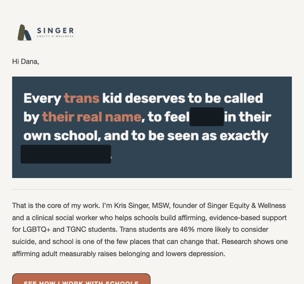
Reveal · tap the redacted words
A censored sentence. The recipient wipes the black marks away and the words restore in terracotta as the card warms slate → cream, resolving into the pitch. 6 variants: Schools, Parents (stat / no-stat), Company (impact / DE&I), Clinicians.
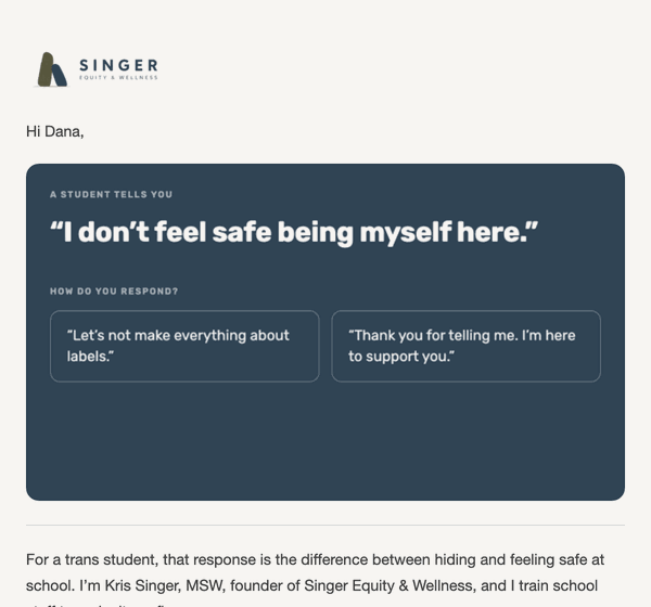
Question · respond to what someone says
A student (or kid / employee / client) says something hard. The reader picks one of two responses. Dismissive is a deliberate dead end, no CTA; affirming opens the pitch. 4 variants. Palette Option C: cream email, deep-slate interaction panel, one terracotta accent.
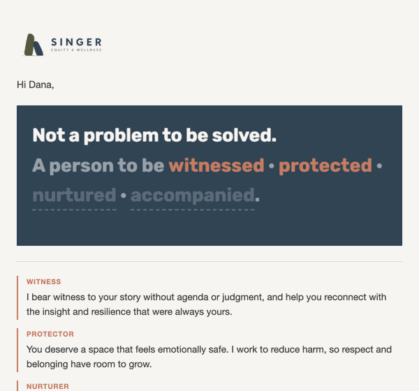
Not a Problem · build the sentence
Kris’s homepage line, assembled one Core Value at a time. Four ghosted words; each tap lights one and unpacks the value (Witness / Protector / Nurturer / Co-Conspirator). 2 variants: LGBTQ+ and a broader resolve.
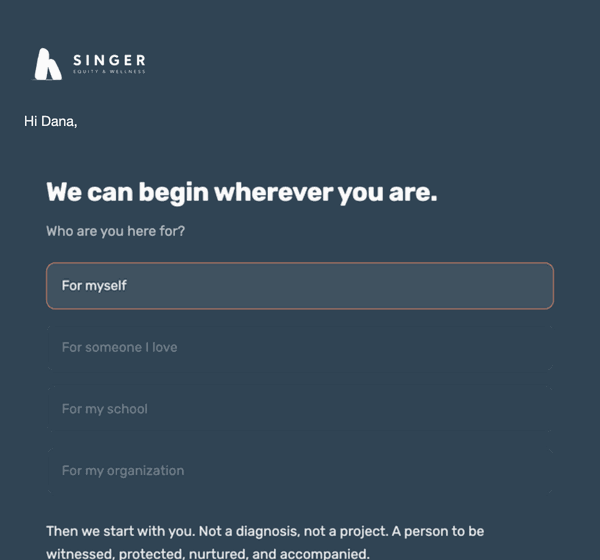
Begin Where You Are · pick a path
Four paths (for myself / someone I love / my school / my organization); each answers in Kris’s voice and routes to a different service page. One email for every audience. Stays slate throughout.
How it works · two layers, one file
Each email carries both a Gmail view and an Apple Mail view; the <style> block is the switch, no media query. Gmail strips the style block and shows a GIF of the reveal plus real text. Apple Mail keeps it and shows the live tappable card. Nothing personalised and nothing clickable ever lives inside a GIF.
- Gmail ≈ 25% of opens, Apple ≈ 50–65% (Litmus 2026).
- No email client runs JavaScript. Interactivity is the CSS
:checkedhack; caniemail’s support table is from 2020, do not trust it as current. - Gmail also strips webfonts, so body copy renders in Helvetica there. The GIF has Rubik baked in.
How to send
These are personal 1:1 emails Kris sends, not a blast. Paste path matters:
- Thunderbird → Write → Insert > HTML… (NOT paste into the body, which strips the style block).
- Config Editor:
mail.compose.attach_http_images = trueso images embed and no “load remote content” prompt appears. - Fill
[Name]and[Organization]; Parents versions say “your family.”
Build gotchas
Every one found the hard way, all in _source/WHAT WE LEARNED.txt:
- Inputs must sit inside the card container or the
~sibling selectors break. :checkedrules need!important(inline fallback outranks classes).- Build the GIF palette from every frame, not frame 0, or colors get remapped.
- GIF height = the tallest state, or growing states clip.
- Paint the card the GIF’s measured final color so it dissolves with no seam.
Assets & sources
Everything is on the media library and in the deliverable folder.
- Email logos: media 3200 / 3201 / 3202 (blue / white / cairn), optimised to render size — 226 KB → 6 KB. The site still loads the 163 KB originals; worth swapping.
- 13 hosted GIFs (Question at v10, rest at v7).
- Copy: Copy Deck FINAL.xlsx. Claims + citations: SOURCES — claims & citations.md (Trevor Project 2024, Ryan 2009, Velez 2023).
- Build pipeline in
_source/build-tools/: sew_copy → build_final → build_fragment → gif_layer.
A 25-icon set curated for slide decks & presentations, all unified to one flat palette so they read as a family. Flat fills only — one brand color per shape, no gradients, no navy. Available as PNG (click any tile to download) and as true-vector SVG in SEW Creative Assets / 8 - Presentations / Recolored.
Concept Icons (16)












Monoliths & Marks (9)





Core Values (4)
The four CARE-framework value marks (used on the About page), folded into the library.
Three icons representing the primary service populations. Used on the Services page and individual service pages. Redesigned to match core values icon visual language: flat fills, bordered inner shapes, tile border.
On service pages these are the raw monolith icons, recolored to brand, sized by height for row alignment in the Areas of Exploration grid. Export: SVG preferred, or PNG ~200px. Standard fill: brand olive #5E624D.
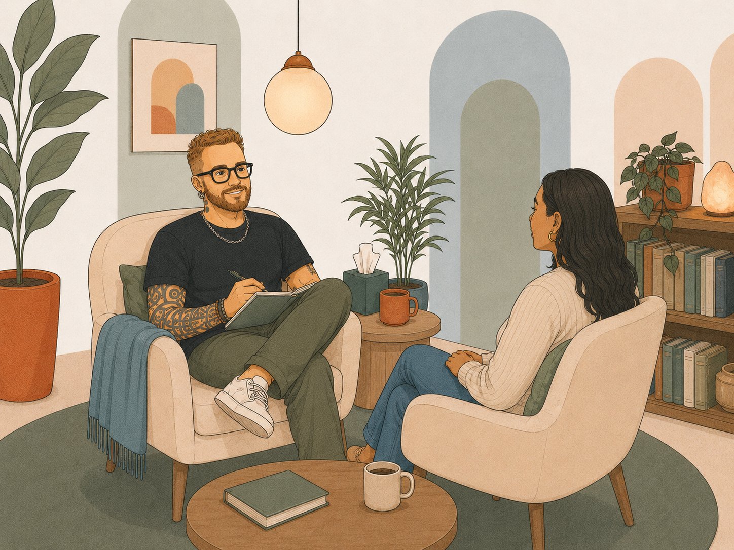
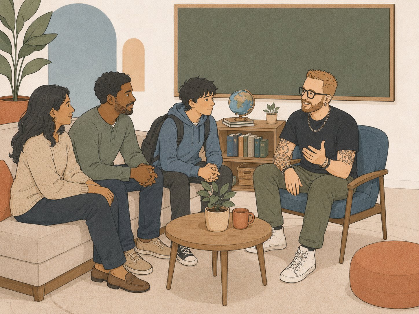
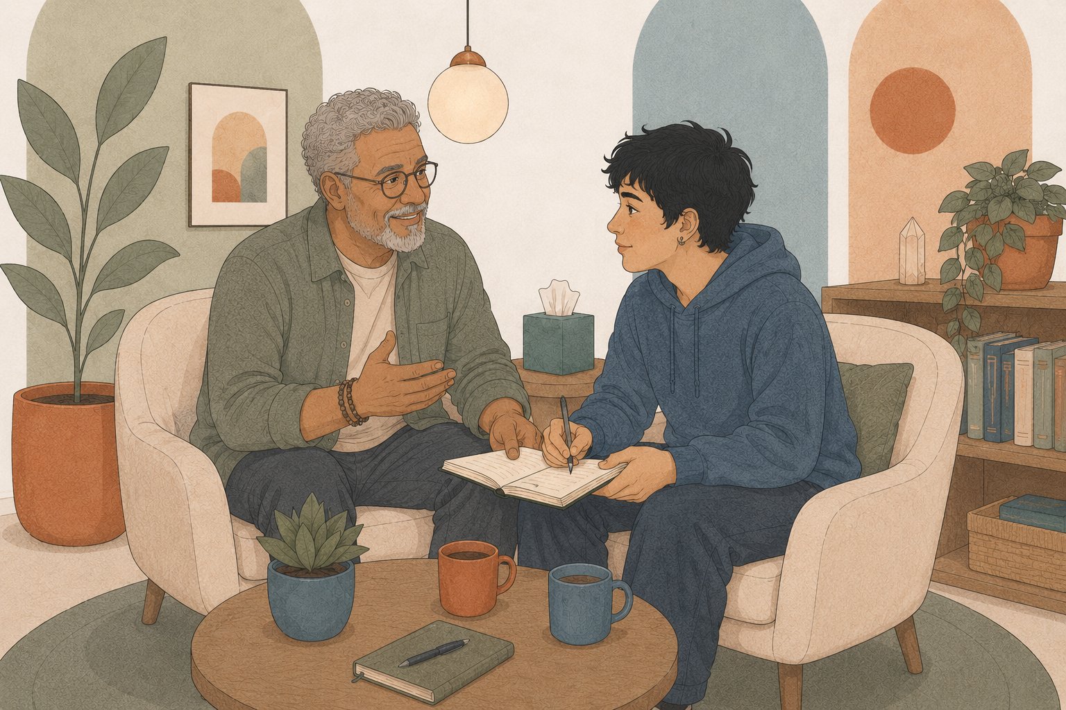
Custom illustrated scenes of a therapy office. The primary brand illustration. Multiple versions for different contexts. Style: flat vector, muted tones matching brand palette.
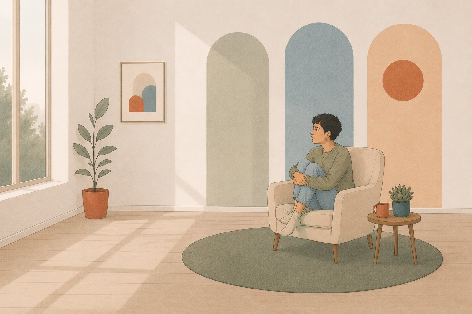
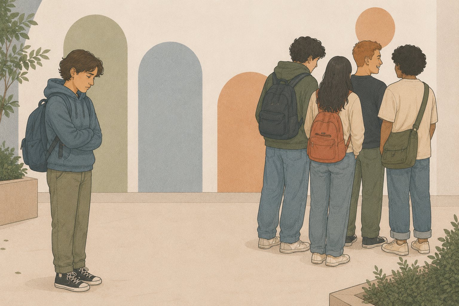
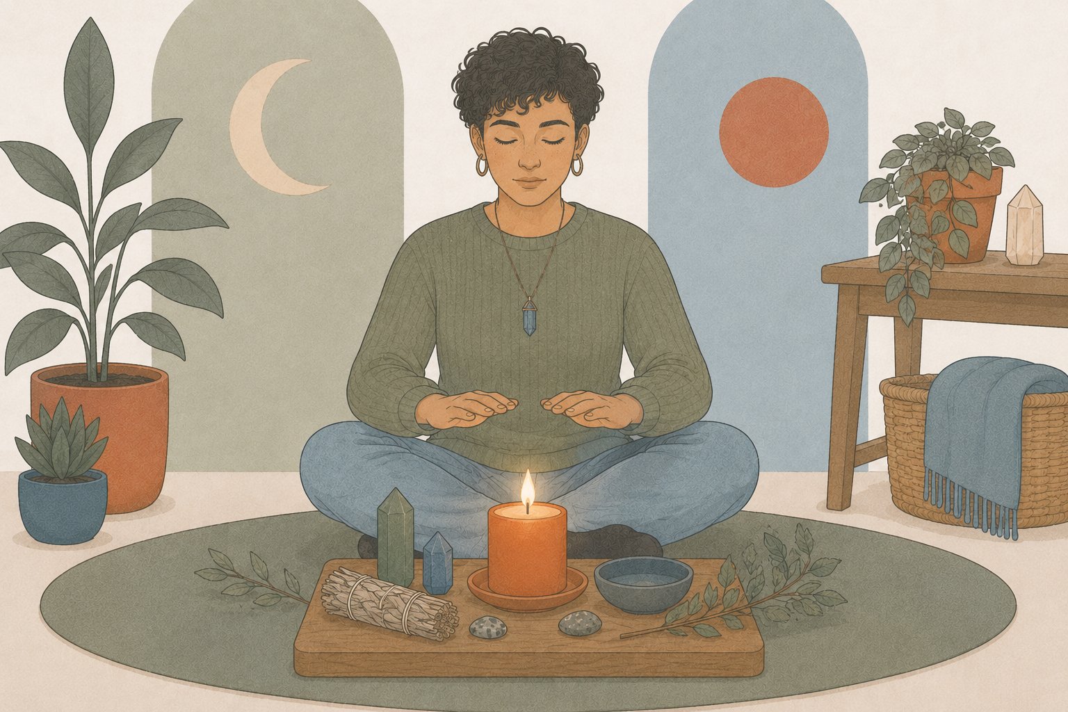
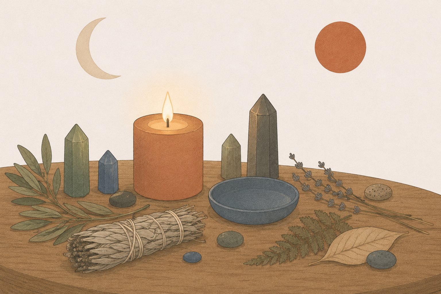
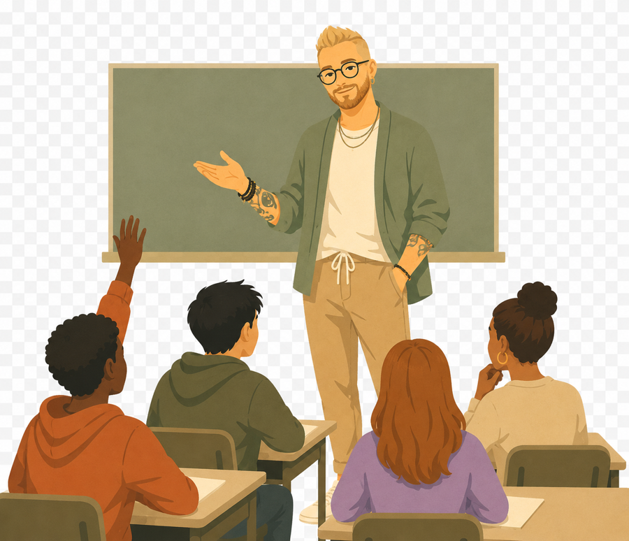
Style: flat, hand-drawn editorial vector — soft, muted, light & airy, high-key. Soft brown linework (no black outlines) with subtle embedded paper grain. Service scenes + Insights art share one house style. Gender-diverse, affirming figures, with a recurring bearded / glasses / forearm-tattoo therapist for continuity. No text, letters, or signs anywhere in the image.
Palette: background warm cream #F0E0D0 (consistent across the set); skin tones light & warm around #D8C0A0; accents Slate #5C7387, Olive #5E624D, Terracotta/sun #C77D63, Stone #334656 — keep saturation low, brightness high.
Generating (ChatGPT / image gen): describe the scene + palette above; one full-bleed image at a time, subject centered. Insights = 3:2 symbolic/landscape; Services = 4:3 interior scenes. Web export: Services 1600×1200 (4:3); Insight posts 1200×800 (3:2); JPEG sRGB ~85%.
Inset usage: when shown as a contained image (home cards, 2-column sections), frame with a 1px solid #1E1E1E border and 10px corner radius. Full-bleed heroes get no border.

Illustration Visual Style
Flat, hand-drawn editorial vector; soft brown linework (no black outlines), subtle paper grain, warm cream ground. Gender-diverse, affirming figures, with a recurring bearded / glasses / forearm-tattoo therapist for continuity. No text or signage anywhere in the image. Service scenes and Insights art share this one house style.
Service Illustrations
Scene illustrations for service pages. 1600×1200 PNG, transparent. Alternating left/right layout.
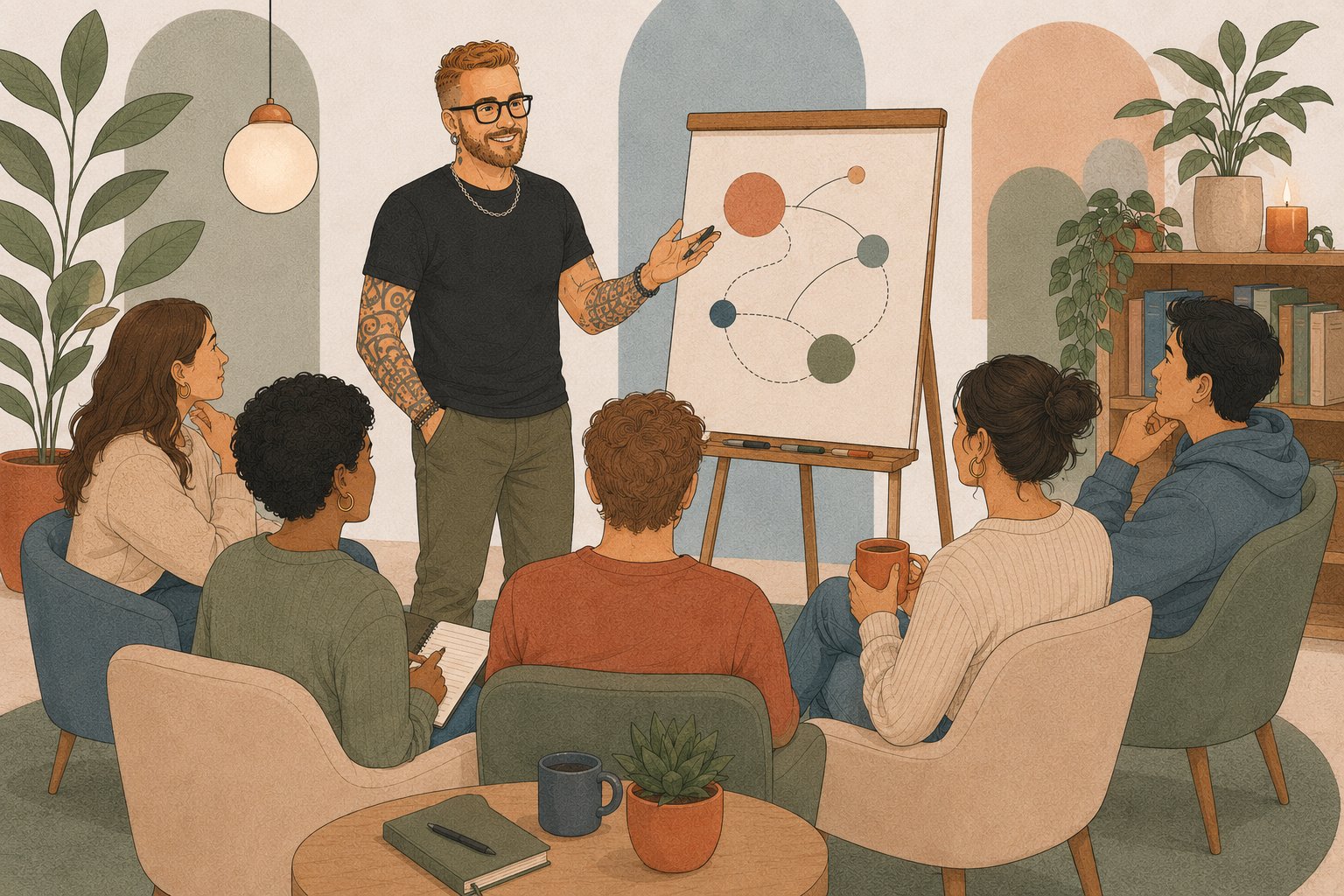
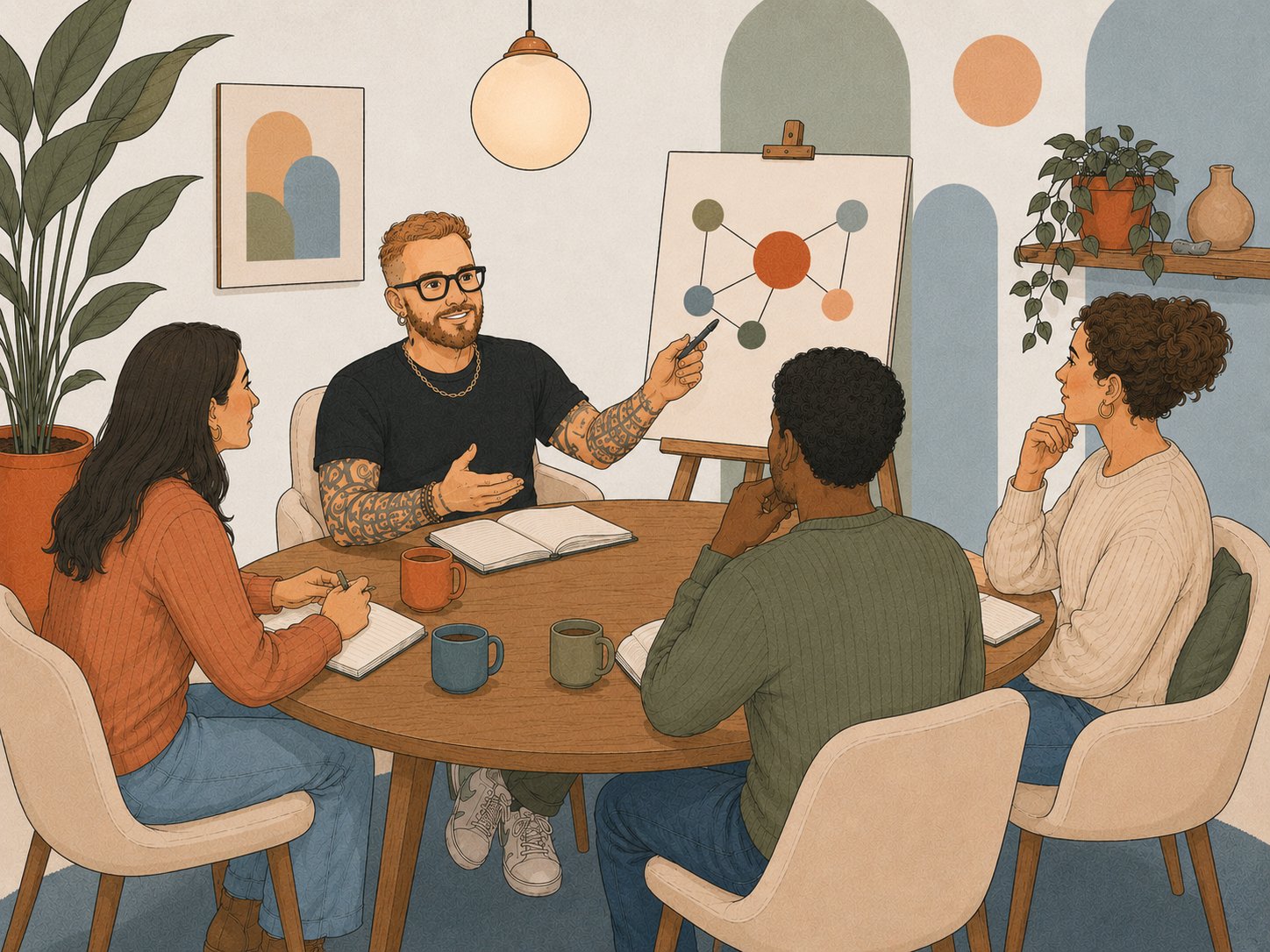
Featured illustrations for the Insights blog posts, built to the post-image spec (3:2, 1200×800px). Each is a workable file — click any to download the PNG. The full illustration library (55 insight scenes) — click any to download.



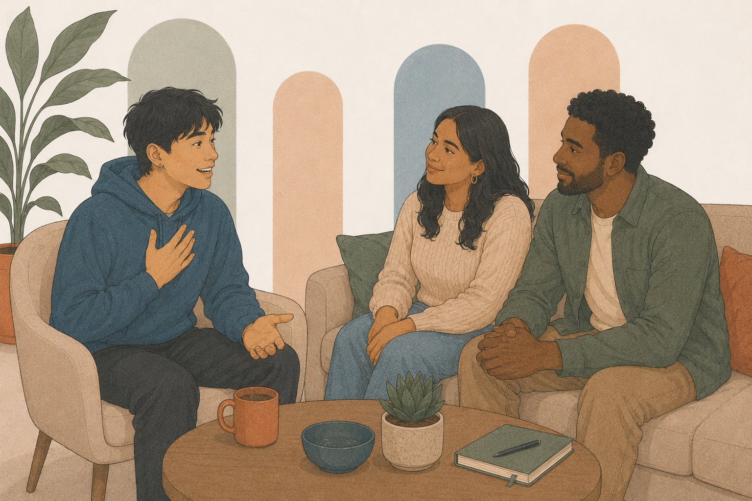





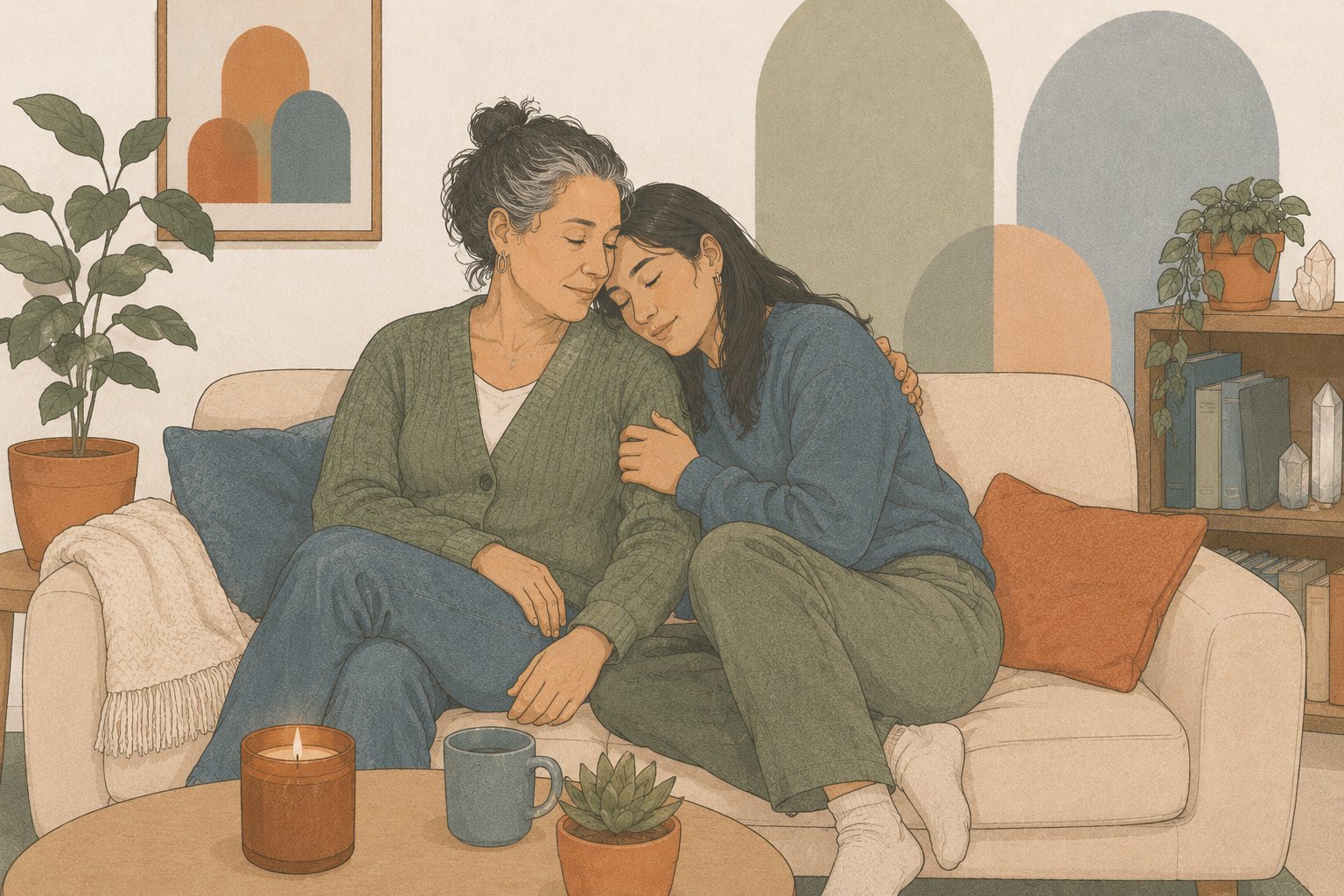
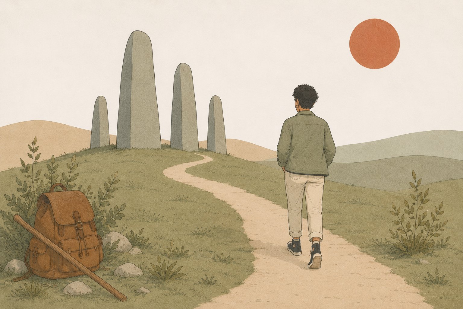
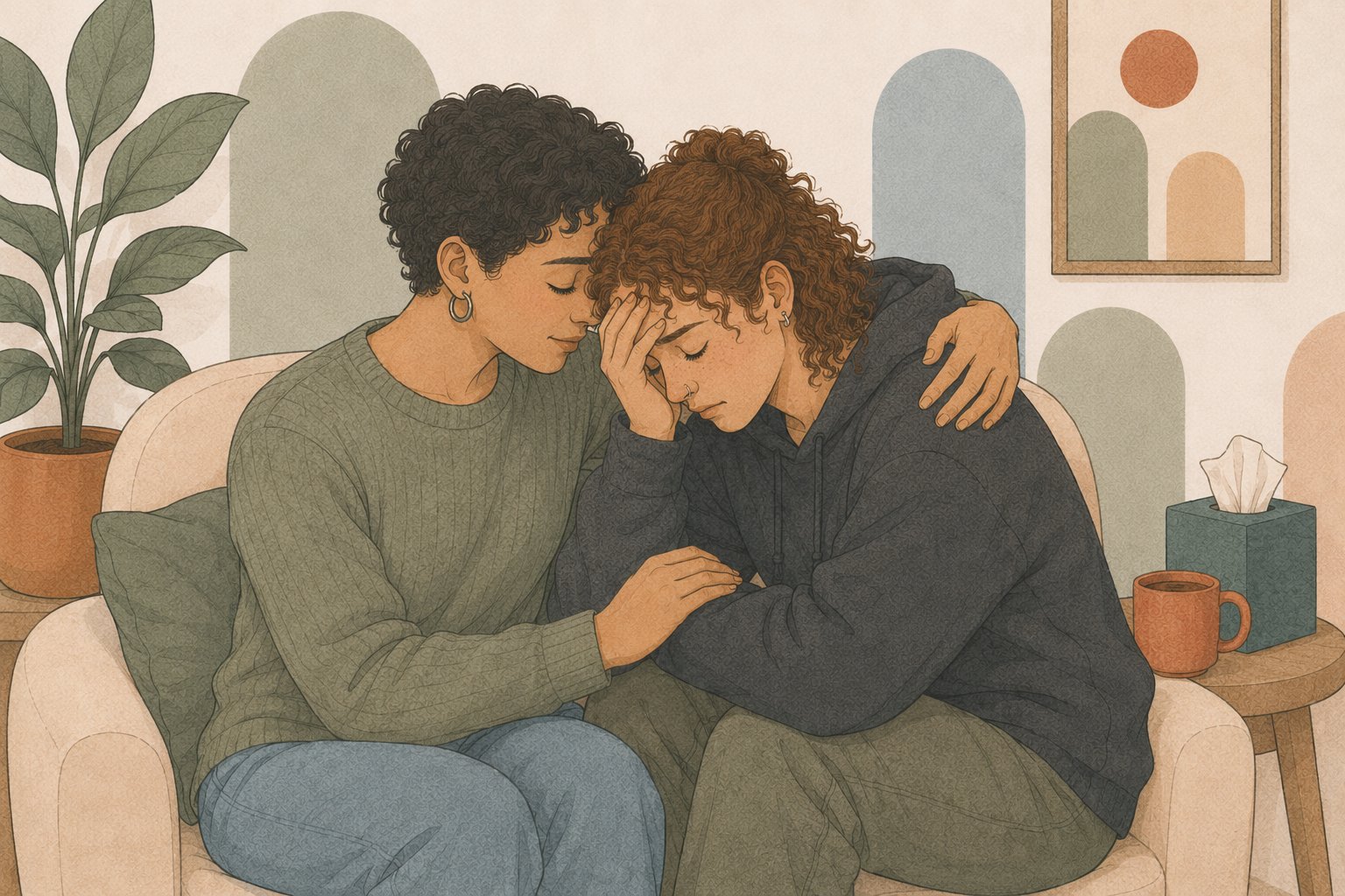

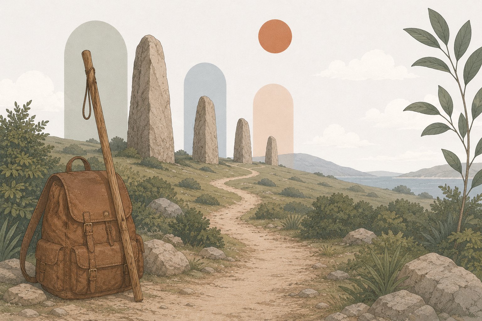

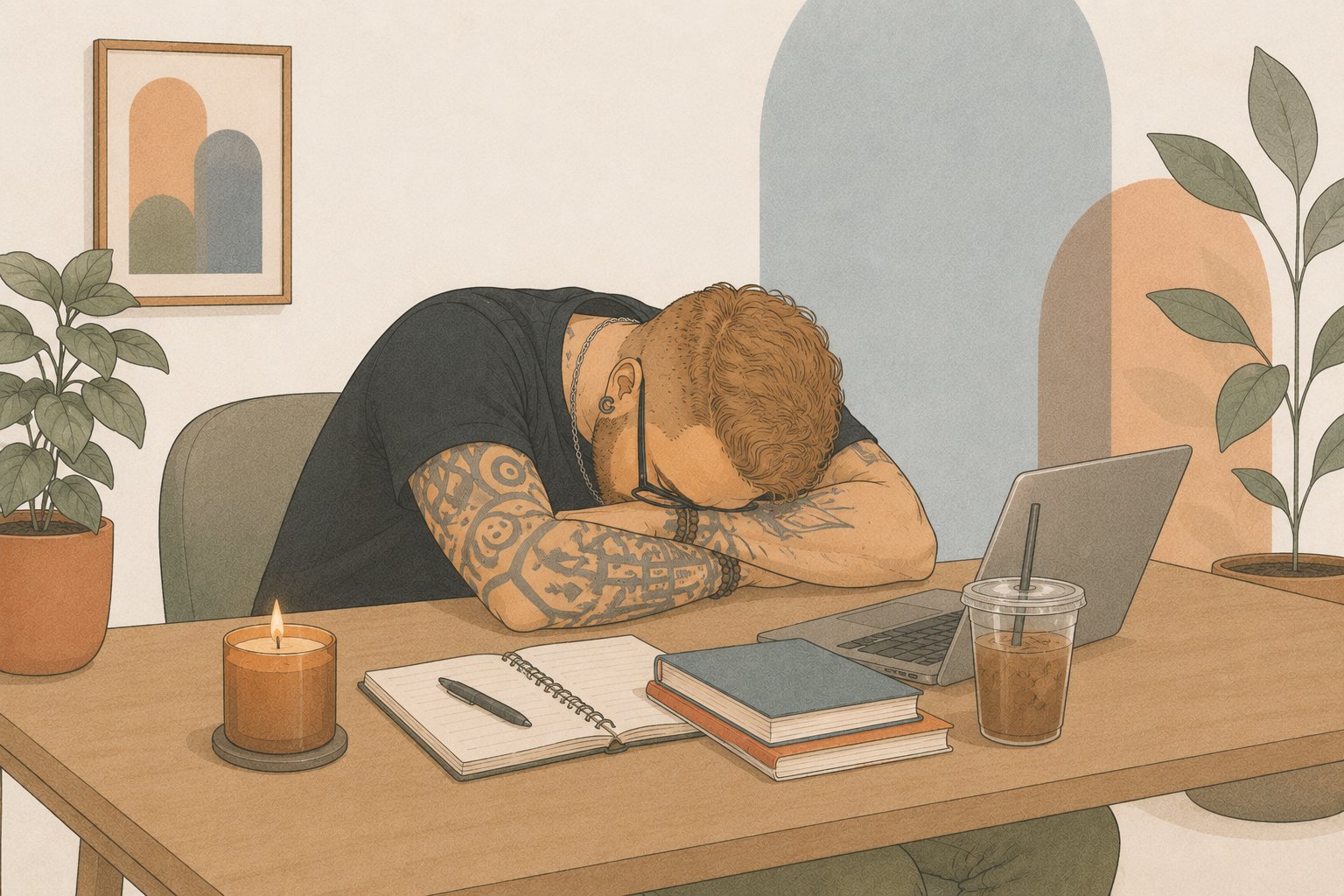

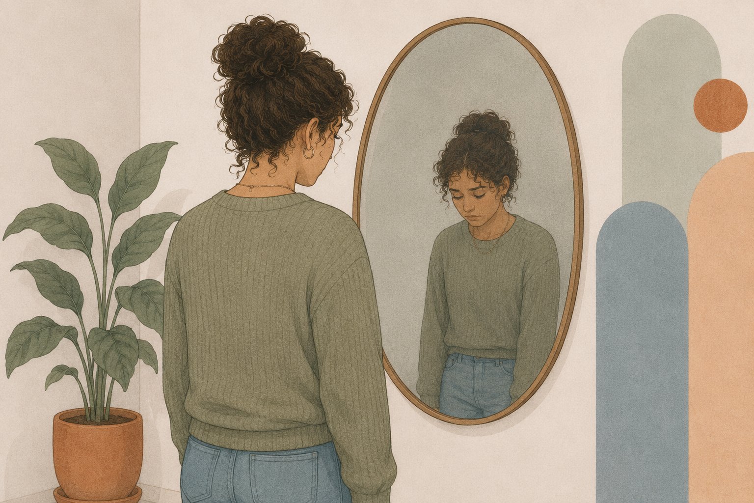










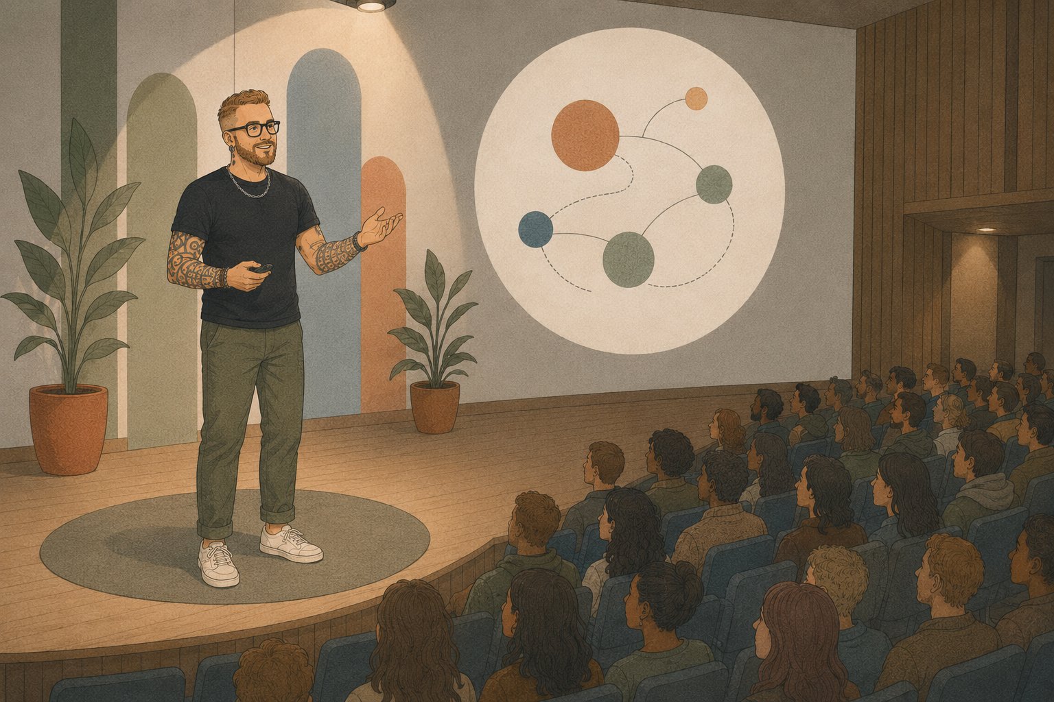
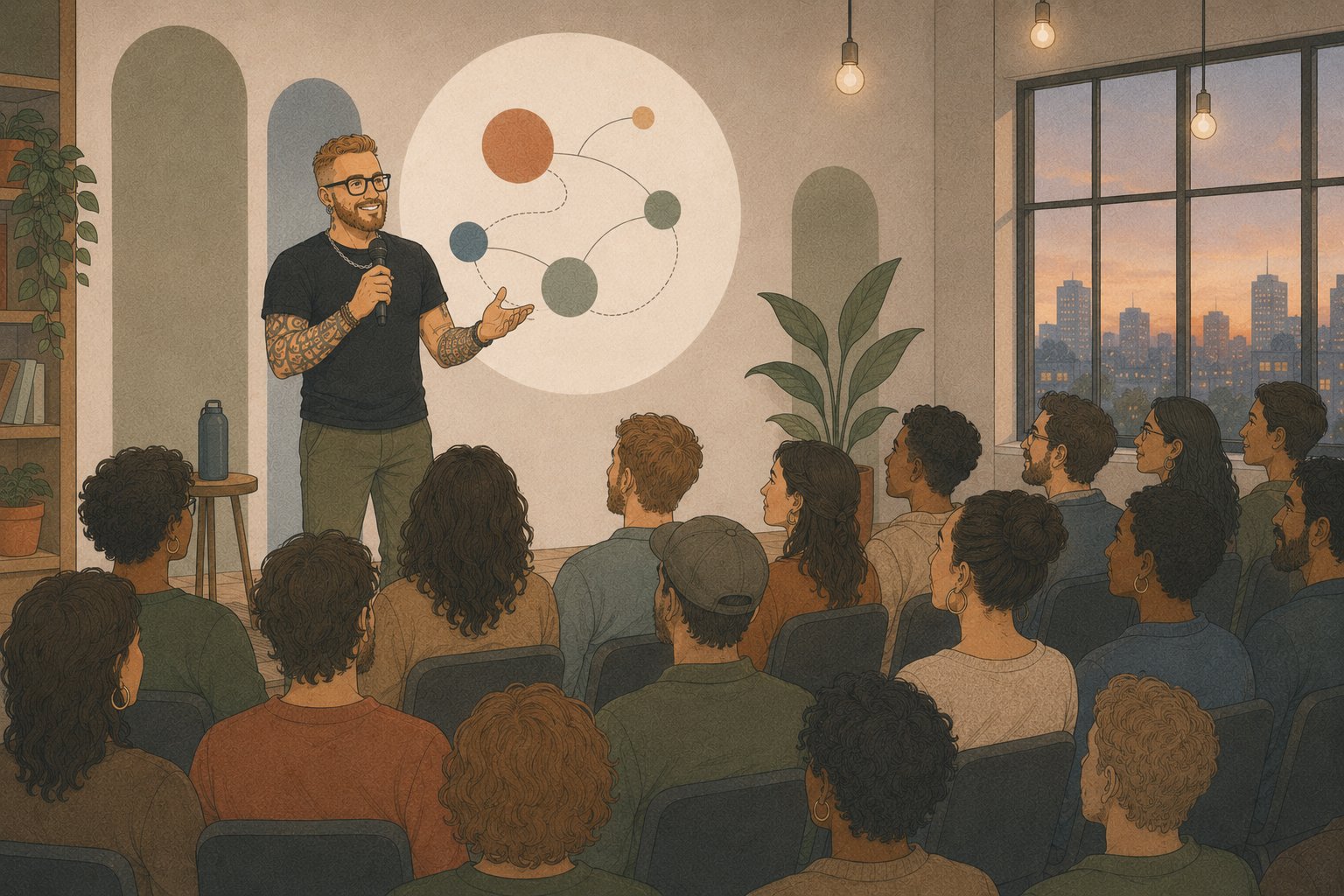
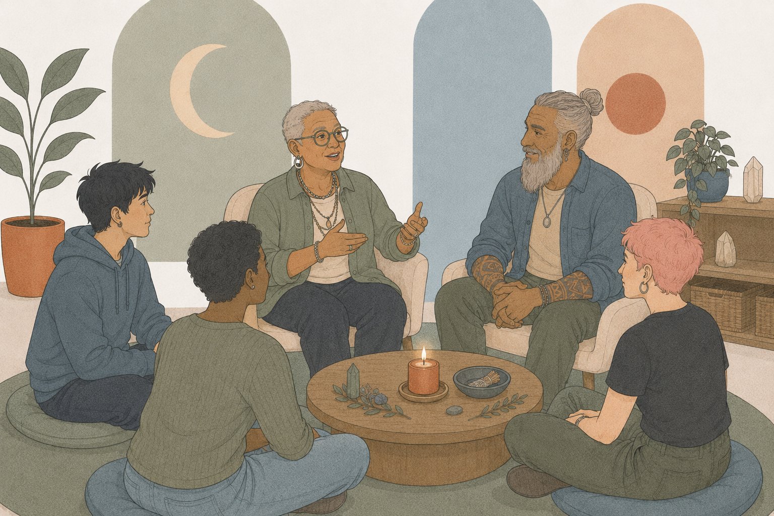
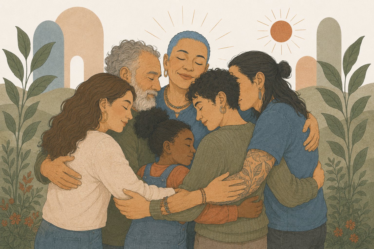


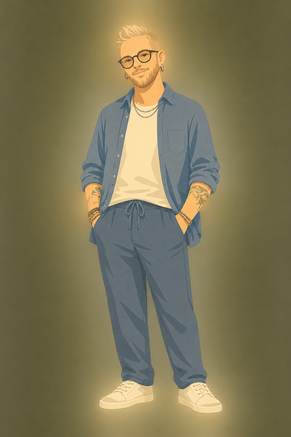
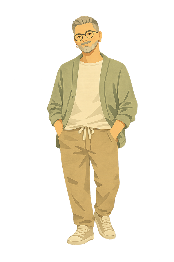
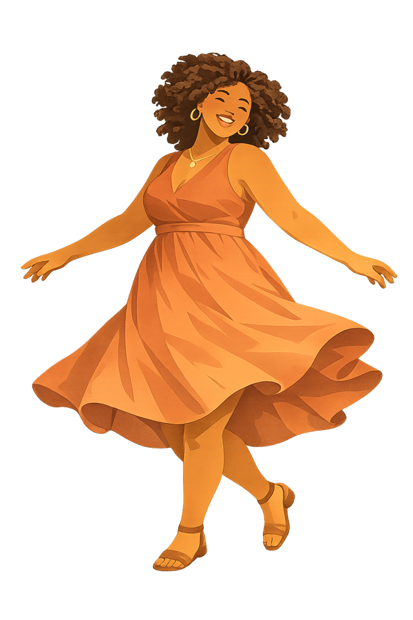
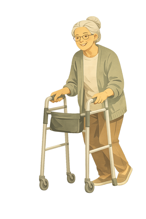
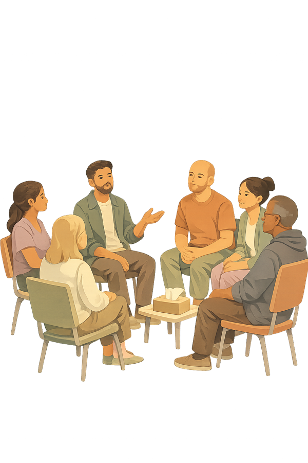
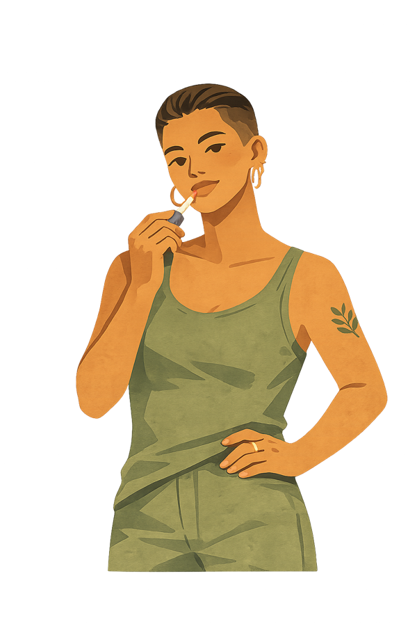
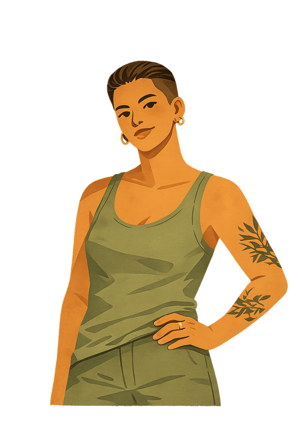
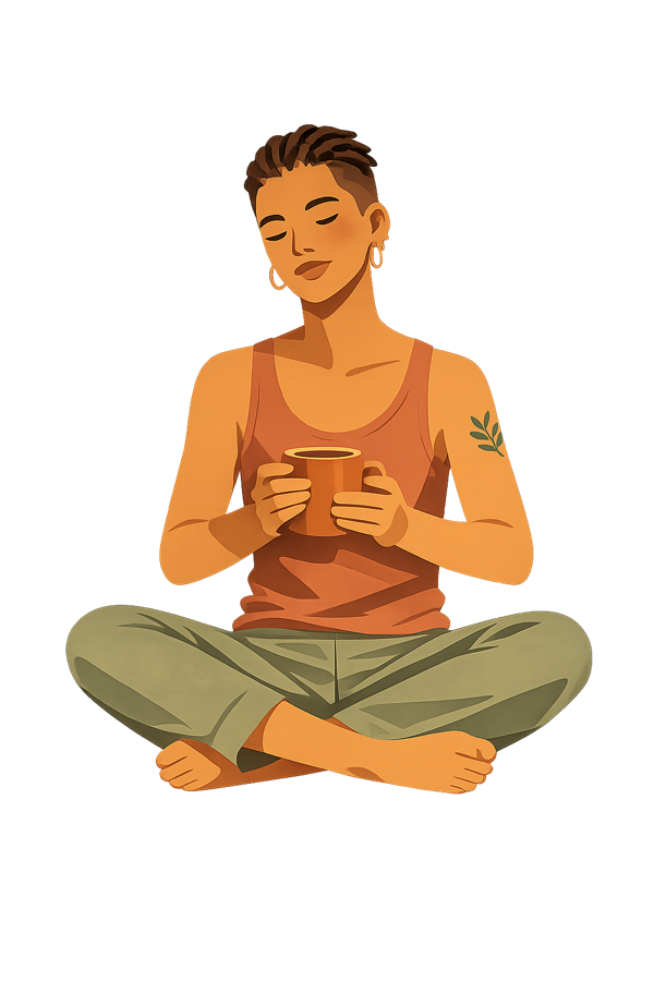
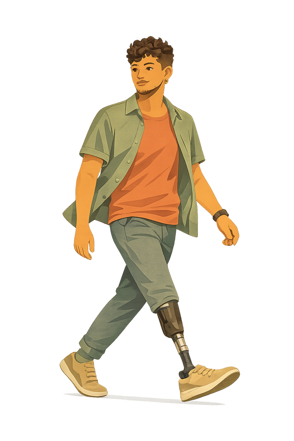
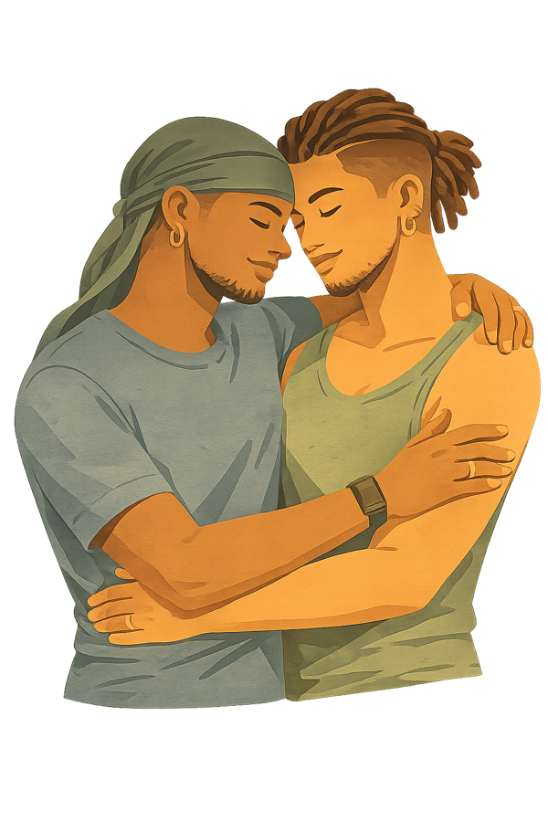
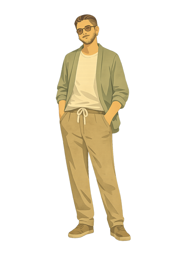
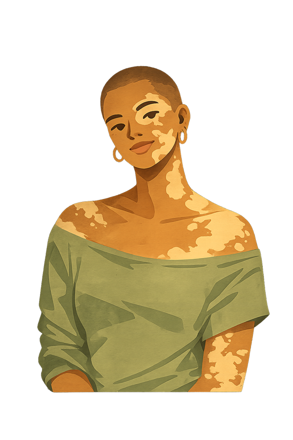
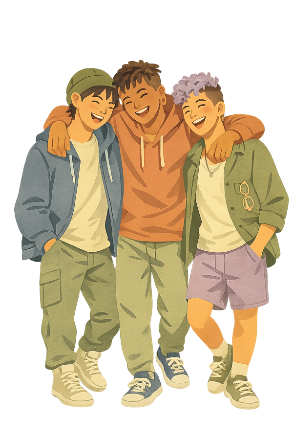
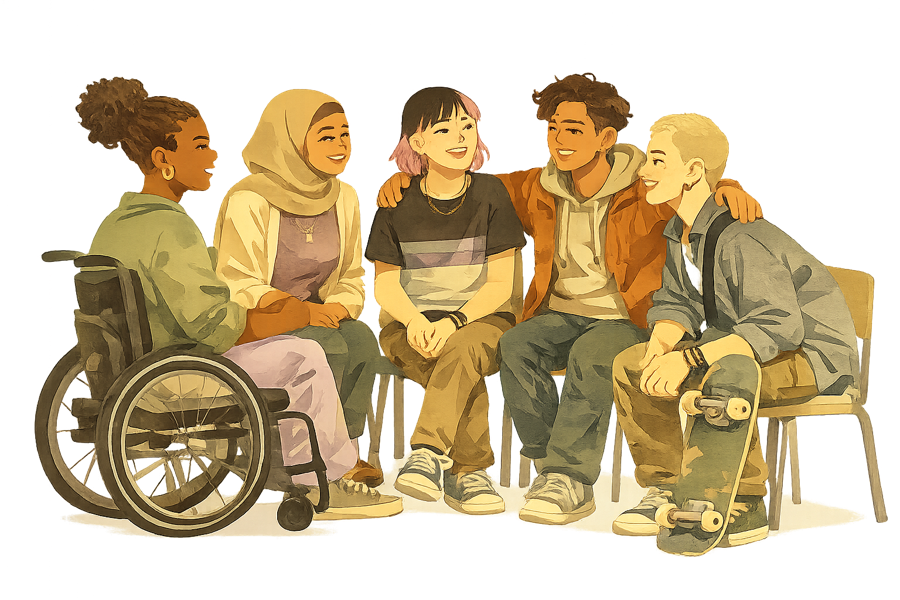
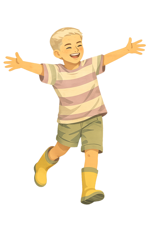
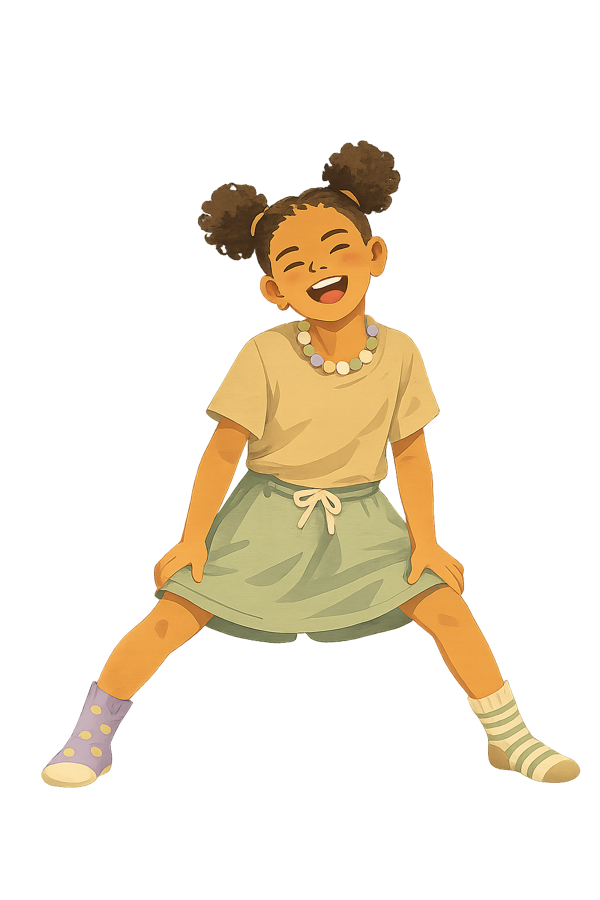
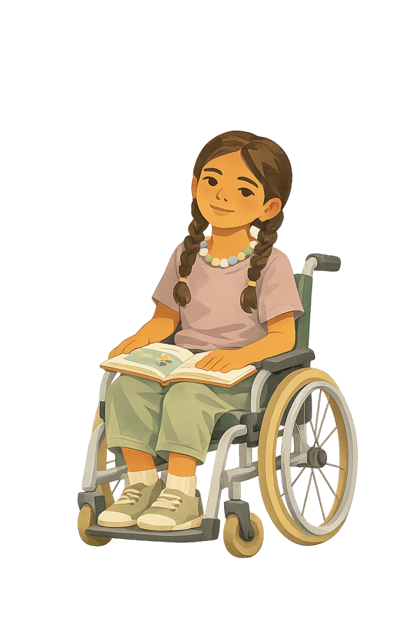
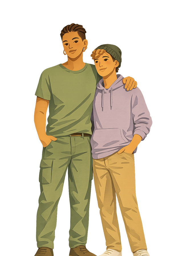
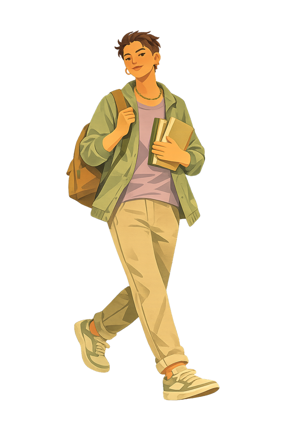
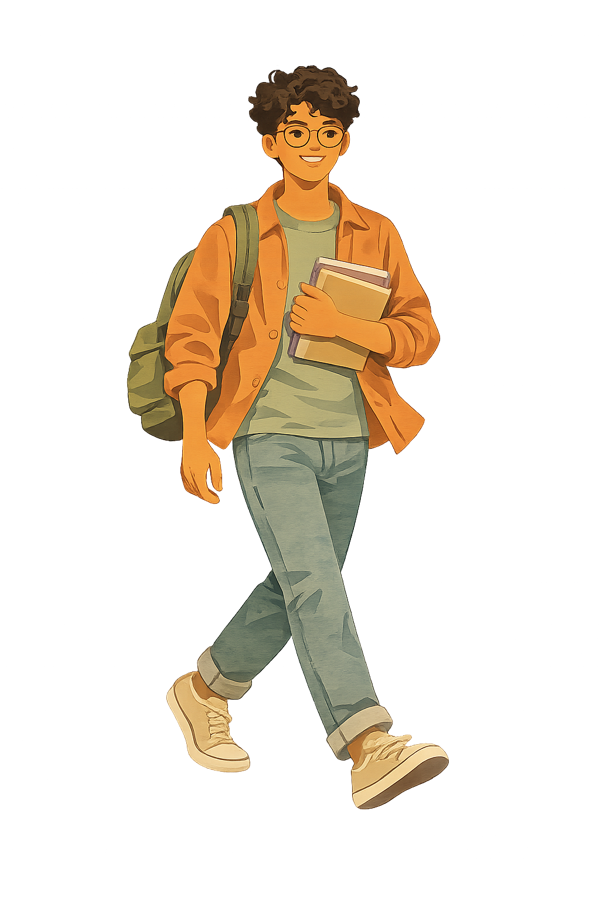
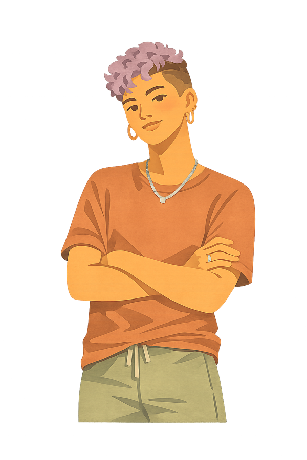
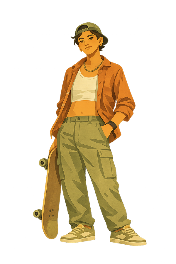
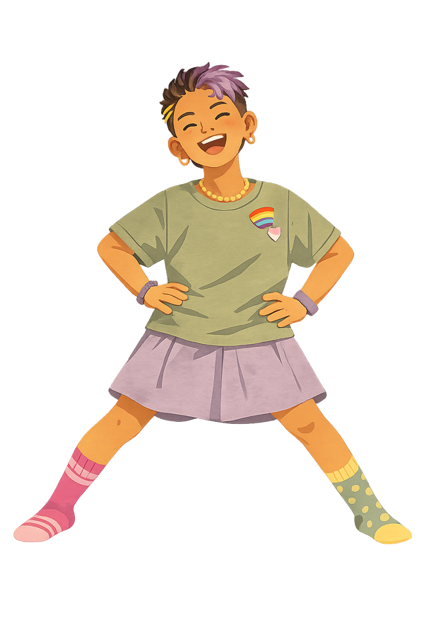
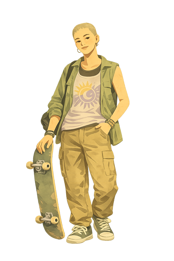
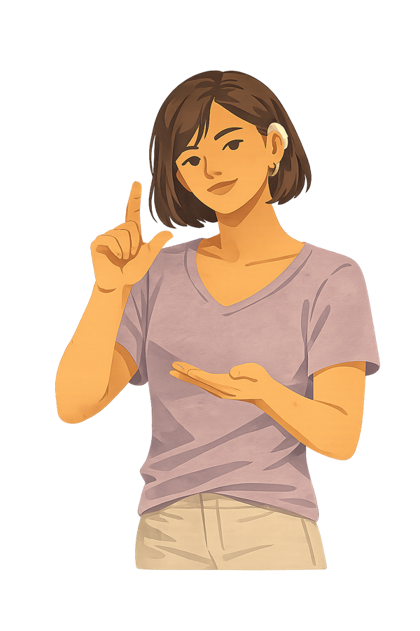
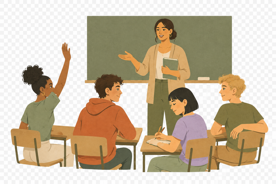
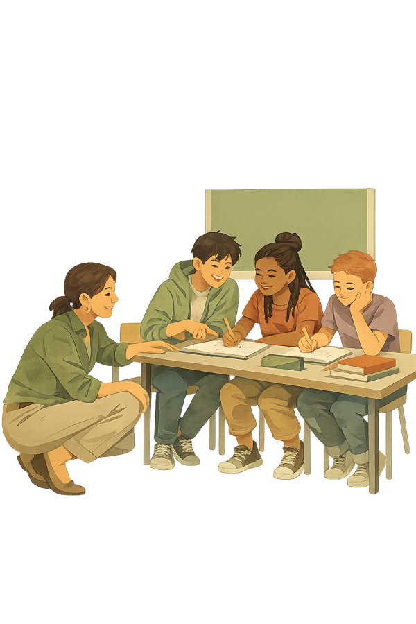
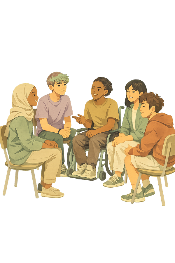
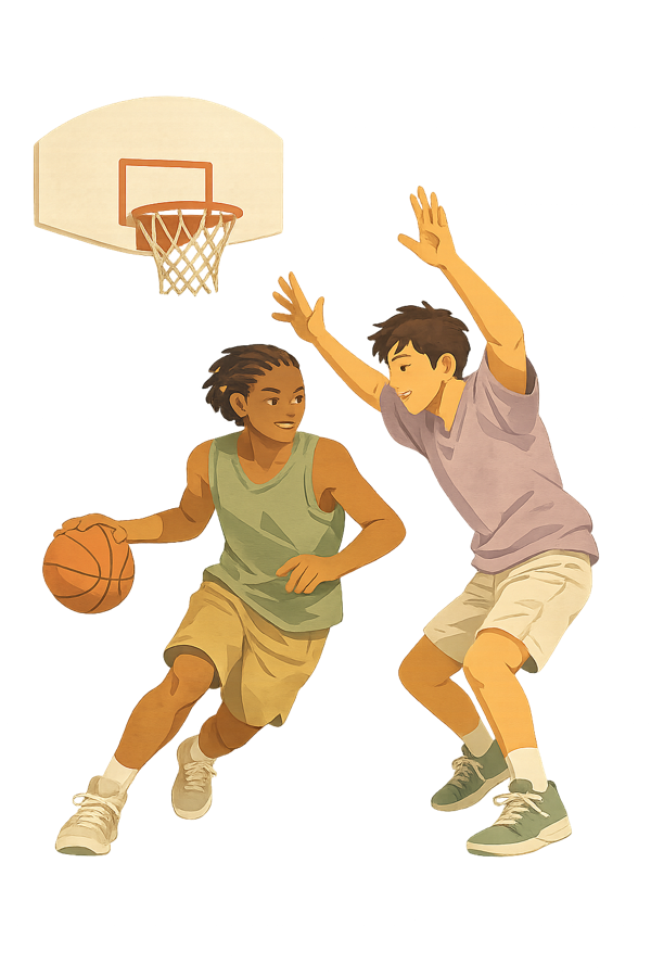
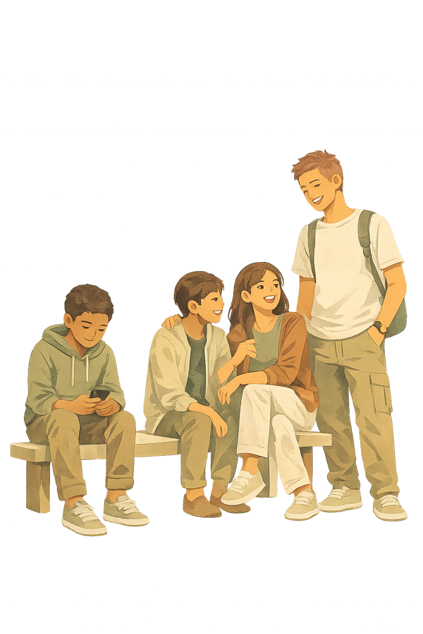
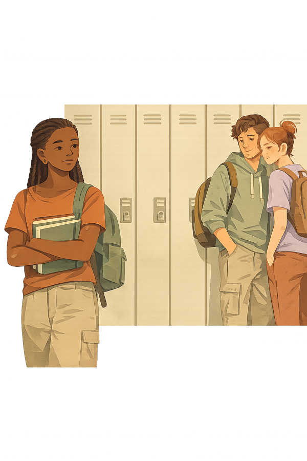
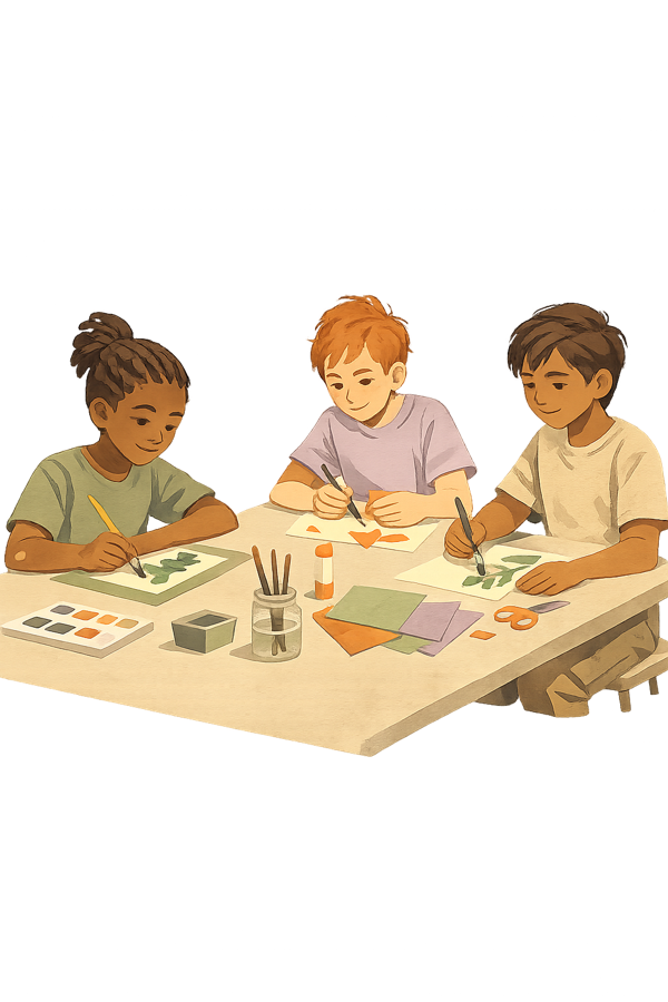
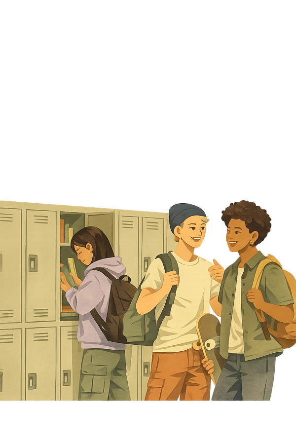
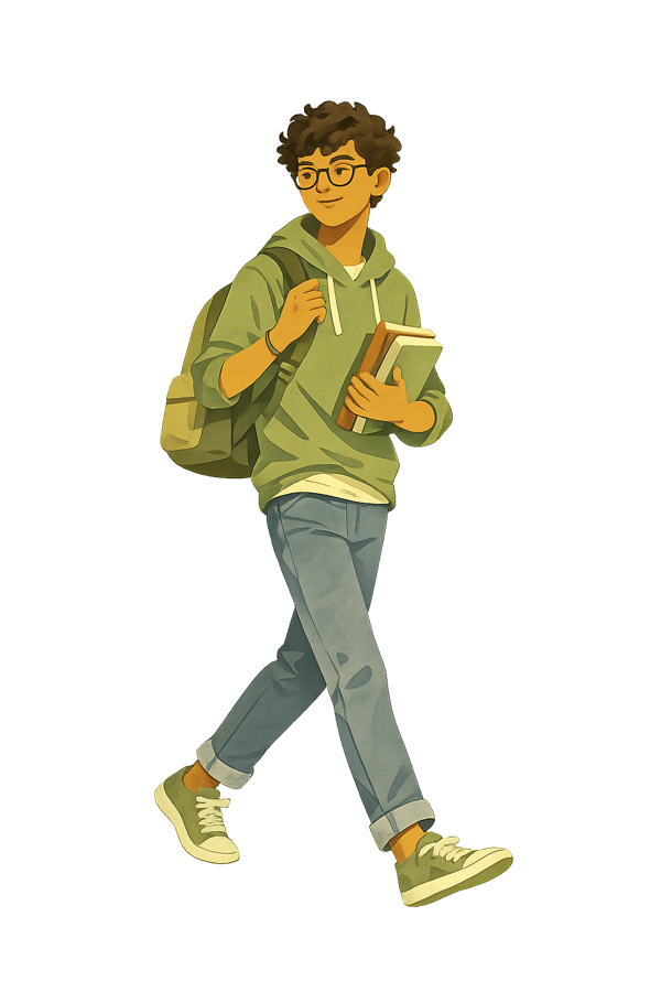
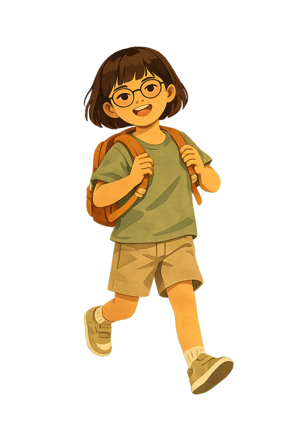
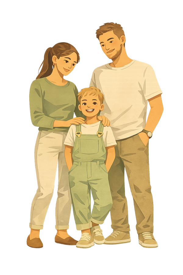
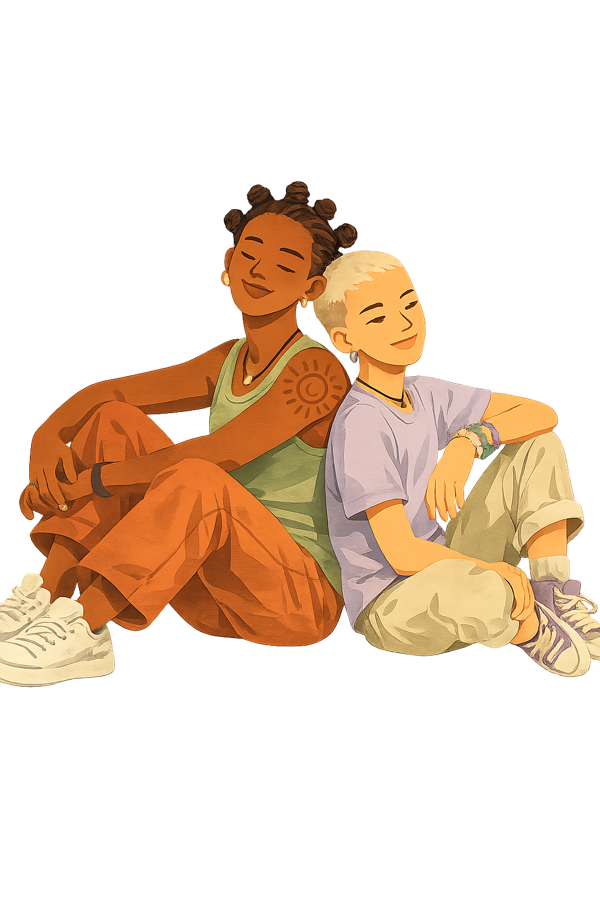
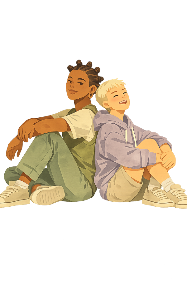
Cut-out character figures (transparent PNG) for slides, decks, and composites — diverse adults, youth, families, and school scenes, plus Kris. Click any to download.
Kris (4)
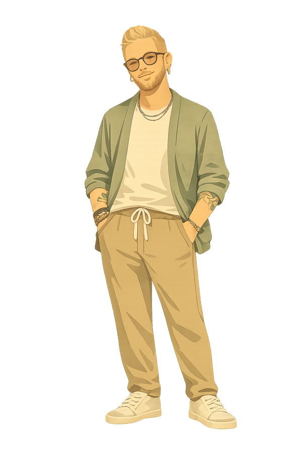
Adult (15)
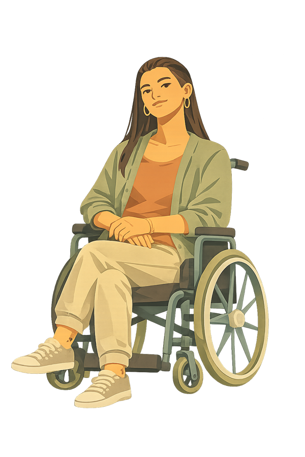
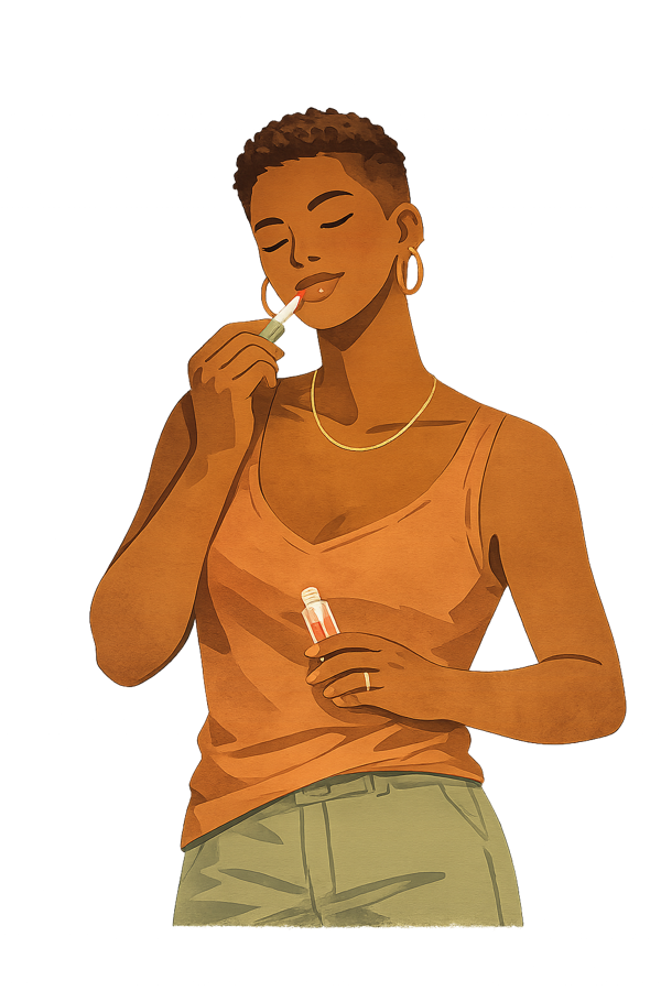



Youth (16)

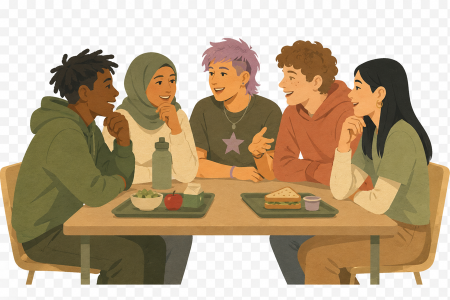

Schools (12)


Family (6)
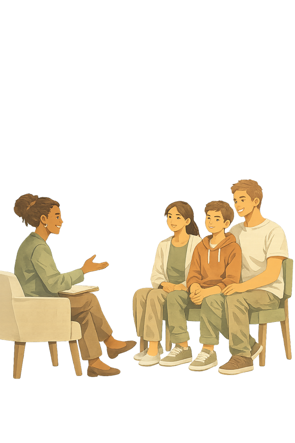
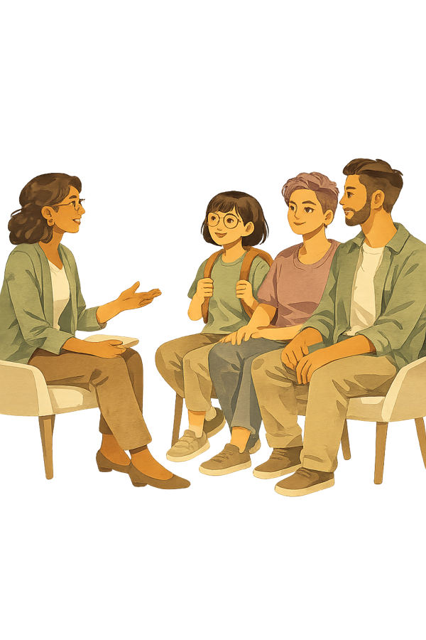
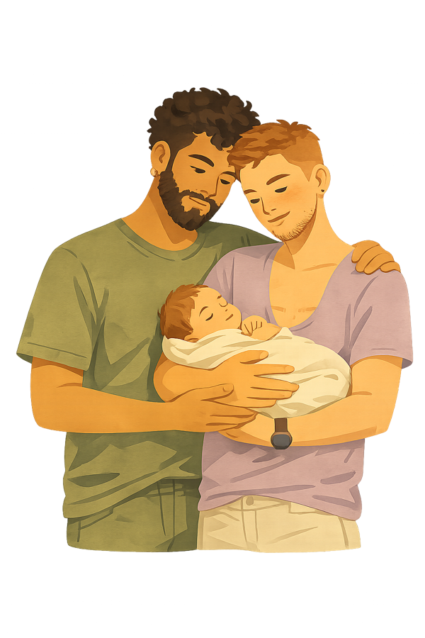
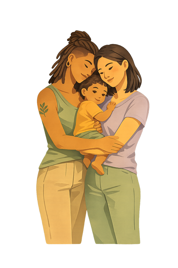
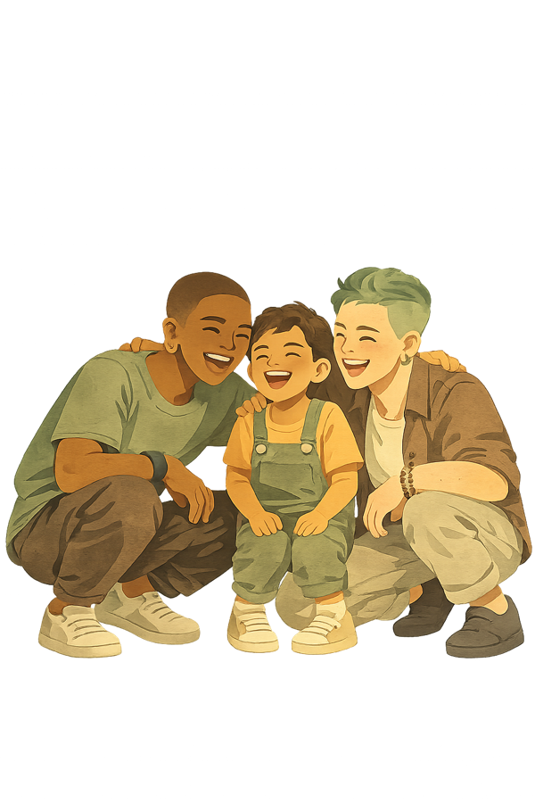
Friends (3)

Block theme: Assembler. Pages stack a full-bleed hero, full-width section groups, the Connect CTA, and the footer. Header & footer are WordPress template parts.
FSE Templates
- Custom:
page(Pages) ·home(Blog Home → renders the Insights index) ·single(Single Posts) - Theme:
template-page-w-hero·template-page-w-title·index·archive·search·404·template-blank - Parts:
header(custom) ·footer(custom) ·header-hero(theme) - Edit via
/wp/v2/templates/pub%2Fassembler%2F%2F{slug}
Header (global)
- Single template part
pub/assembler//header, referenced bare by every template (page,home,template-page-w-title) — identical on every page - Background: cream
#F7F5F2; 1px bottom border; sticky on scroll - Logo:
site-logoimage, 190×71px, stone-blue#334656mark, links to home - Row: full-width, 6vw side gutter; 8px top/bottom padding
- Nav: Rubik 14px; CTA = terracotta GET STARTED (no other buttons)
Footer
- Cream
#F7F5F2background (light, matching header), dark text + links; Brand Guide link in bottom row
Page stack (top → bottom)
- Hero (cover, 440px tall — capped by the global
.hero-overlayrule; verified live at 1440px on Home, About and Individual Care) - My Philosophy intro — home only, directly under the hero
- Content section groups (alignfull)
- Care Cairn — synced pattern
2957, on Home, About, Resources, Training and Insights (not site-wide; Services, Individual Care, Schools, Résumé and Request do not carry it). The old CARE Framework (1529) was retired Jul 15 2026. - Connect CTA
- Footer
Insights index
- Page 34 (
/thought-leadership/) has no content — rendered by thehometemplate (pub/assembler//home)
Insights — Post Images
- Featured image renders at 3:2 (
post-featured-image,aspectRatio 3/2,object-fit:contain) — crop to 3:2 or it letterboxes - 3-column grid at wide width (~1240px) → each card renders ~380px; full content-width single column on mobile
- Upload 1200×800px (3:2) for crisp retina · min 800×533 · max useful ~1600 wide
- JPG ~80% for photos; PNG for screenshots/text graphics · target <300KB (WP auto-builds the resized
srcset)
Areas of Exploration & Explore My Work
- Redesigned Jul 15 2026. Areas of Exploration is no longer a 6-item open grid — it is a shelf of 6 tappable icon tiles + one reveal panel (no-JS
:target). - Now synced, one pattern per page (copy differs per page, so they are deliberately not shared): Individual Care
3020· Schools3120· Training3121. - Explore My Work is the same story: Schools
3062· Training3123. - Each is editable from the pattern library; the pages reference them instead of holding inline copy.
This Style Guide page hides the site header/footer via .page-id-1261 .wp-block-template-part{display:none}.
All published pages with their WordPress page IDs. IDs are stable and used in REST API calls and page-specific CSS targeting.
Core Pages
- Home — ID 1 · / (front page)
- About — ID 1628 · /about/
- Services — ID 48 · /services/
- CARE Framework — ID 3287 · /care-framework/
- Insights — ID 34 · /thought-leadership/
- Resources — ID 350 · /lgbtq-tgnc-affirming-resources/
- Resume — ID 746 · /resume/
- Get Started — ID 984 · /request/
- Brand Guide — ID 1261 · /brand-style-guide/ (this page)
Service Sub-pages
- Individual Care — ID 1643 · /individual-care/
- Schools & Caregivers — ID 1636 · /schools-communities/
- Training & Education — ID 1644 · /training-education/
Page-Specific CSS
WordPress adds a .page-id-{N} class to the body element. Use this to scope page-specific CSS overrides without affecting global styles.
Example: .page-id-1628 .wp-block-group { ... }
Every block on every page, in order, with the sections inside it (live REST scan, Aug 3 2026 — the site drifts, re-scan before relying). Blocks are numbered by position, so any block has an address like About · 4; a section inside a block, or a pattern nested in one, reads 2.1. Labels are each block’s own visible heading. hero = cover · synced = reusable pattern (ID pill) · native = page-specific block · sect = a section inside a Custom HTML block
HOME★ front page1
/ · 11 blocks · live scan Aug 3 2026
INSIGHTSblog index34
/thought-leadership · 0 blocks · live scan Aug 3 2026
home template:SERVICES48
/services · 3 blocks · live scan Aug 3 2026
CARE FRAMEWORK3287
/care-framework · 10 blocks · live scan Aug 3 2026
ABOUT1628
/about · 9 blocks · live scan Aug 3 2026
Individual Care1643
/individual-care · 10 blocks · live scan Aug 3 2026
Youth & Familiesnew hub3733
/youth-families · 16 blocks · live scan Aug 3 2026
School Communities1636
/schools-communities · 11 blocks · live scan Aug 3 2026
Training & Education1644
/training-education · 22 blocks · live scan Aug 3 2026
RESOURCES350
/lgbtq-tgnc-affirming-resources · 5 blocks · live scan Aug 3 2026
RESUME746
/resume · 6 blocks · live scan Aug 3 2026
BRAND GUIDE1261
/brand-style-guide · 1 blocks · live scan Aug 3 2026
REQUESTGET STARTED984
/request · 3 blocks · live scan Aug 3 2026
Platform, theme, and key technical configuration for the site.
Platform
- WordPress.com (hosted)
- Theme: Assembler (FSE)
- Site ID: 255058468
- Admin: singerwellness-pajsi.wordpress.com
- Public domain: singerwellness.org
Global Styles
- REST:
GET /wp/v2/global-styles/2 - Custom CSS lives in
styles.css - When POSTing: always include
typographyandelementsalongsidecss - Changes apply instantly (bypasses CDN cache)
Block Style Names
.is-style-section-2— Olive bg.is-style-section-3— Terracotta bg.is-style-default— Cream bg.alignfull— full viewport width.alignwide— wide (slightly inset).has-background— custom bg set.has-global-padding— uses theme padding
Key REST Endpoints
GET/POST /wp/v2/pages/{id}GET/POST /wp/v2/global-styles/2GET /wp/v2/media/{id}GET /wp/v2/template-partsGET /wp/v2/settings
CDN / Caching Notes
- Page content updates cached by WP.com CDN
- CSS (global styles) applies instantly
- Force-publish with
status: 'publish' - OG images served via
i0.wp.comCDN
Social / OG Images
- A page’s LinkedIn/OG preview = its Featured Image (
featured_media), set via REST - On FSE pages it does NOT render in the body (safe); on posts it also becomes the visible hero — don’t use for posts
- Crop to 1200×630 (LinkedIn hard-crops to 1.91:1); keep the subject’s head safe
- LinkedIn caches previews ~7 days — bust with a
?v=Nquery on the shared URL or Post Inspector - Service pages → service illustrations; Home → Kris 1200×630 card
Hero Image Crop (gotcha)
- Jetpack’s lazy-load JS rewrites a cover image’s
object-positionat runtime — editing the block focal point saves but has no visual effect - Force it with page-scoped CSS
!important:body.page-id-1 .hero-overlay img{ object-position:50% 24% !important } - Theme caps hero cover
min-heightto ~440px on desktop regardless of the block’s stored value
Limitations
- Query Loop blocks don’t render on static pages
- Use static post cards instead
- Template parts: footer slug =
footer - Cannot add custom plugins on .com plan
All custom CSS added to WordPress Global Styles (lives in /wp/v2/global-styles/2 → styles.css). Do not remove existing rules when updating.
/* ── Canonical button style — all buttons site-wide ── */
.wp-block-button__link,
.wp-element-button,
.wp-block-button.is-style-outline .wp-block-button__link,
.wp-block-button.is-style-fill .wp-block-button__link {
	font-family: Rubik, sans-serif !important;
	font-size: 14px !important;
	font-weight: 600 !important;
	text-transform: uppercase !important;
	letter-spacing: .06em !important;
	background-color: #BC6A4E !important;
	color: #fff !important;
	border-radius: 10px !important;
	border: 1px solid #1E1E1E !important;
	padding: 14px 26px !important;
	white-space: nowrap !important;
	box-shadow: none !important;
}

/* GET STARTED header CTA button */
.header-cta-btn .wp-block-navigation-item__content {
	background-color: #BC6A4E;
	color: #fff !important;
	border-radius: 10px;
	border: 1px solid #BC6A4E;
	padding: 6px 18px;
	text-decoration: none !important;
	white-space: nowrap;
	line-height: 1.5;
	font-family: Rubik, sans-serif !important;
	font-size: 14px !important;
	font-weight: 600 !important;
	text-transform: uppercase !important;
	letter-spacing: .06em !important;
}

.header-cta-btn .wp-block-navigation-item__content:hover {
	opacity: .9;
}

/* === Dropdown Nav Styles === */
.wp-block-navigation .wp-block-navigation__submenu-container .wp-block-navigation-item__description {
	display: block !important;
	font-size: 12px;
	color: #7a8f9e;
	font-weight: 400;
	text-transform: none;
	line-height: 1.3;
	letter-spacing: 0;
	font-family: var(--wp--preset--font-family--lora);
	font-style: italic;
}

.wp-block-navigation__submenu-container .wp-block-navigation-item__content {
	display: grid !important;
	grid-template-columns: 22px 1fr;
	column-gap: 10px;
	padding: 10px 20px;
	min-width: 280px;
	text-decoration: none !important;
	align-items: start;
}

.wp-block-navigation__submenu-container .wp-block-navigation-item__label {
	grid-column: 2;
	grid-row: 1;
	font-weight: 400;
	line-height: 1.3;
	text-transform: none;
	font-style: normal;
}

.wp-block-navigation__submenu-container .wp-block-navigation-item__description {
	grid-column: 2;
	grid-row: 2;
}

.wp-block-navigation__submenu-container .wp-block-navigation-item__content::before {
	content: '';
	grid-column: 1;
	grid-row: 1 / 3;
	align-self: start;
	margin-top: 2px;
	width: 18px;
	height: 18px;
	min-width: 18px;
	display: block;
	background-color: #5c7387;
	-webkit-mask-repeat: no-repeat;
	-webkit-mask-position: center;
	-webkit-mask-size: contain;
	mask-repeat: no-repeat;
	mask-position: center;
	mask-size: contain;
}

/* Resources: gavel | users | player-play | book | microscope */
.nav-legislation-tracker > .wp-block-navigation-item__content::before {
	-webkit-mask-image: url('https://cdn.jsdelivr.net/npm/@tabler/icons@2.47.0/icons/gavel.svg');
	mask-image: url('https://cdn.jsdelivr.net/npm/@tabler/icons@2.47.0/icons/gavel.svg');
}

.nav-youth-families > .wp-block-navigation-item__content::before {
	-webkit-mask-image: url('https://cdn.jsdelivr.net/npm/@tabler/icons@2.47.0/icons/users.svg');
	mask-image: url('https://cdn.jsdelivr.net/npm/@tabler/icons@2.47.0/icons/users.svg');
}

.nav-educational-videos > .wp-block-navigation-item__content::before {
	-webkit-mask-image: url('https://cdn.jsdelivr.net/npm/@tabler/icons@2.47.0/icons/player-play.svg');
	mask-image: url('https://cdn.jsdelivr.net/npm/@tabler/icons@2.47.0/icons/player-play.svg');
}

.nav-essential-reading > .wp-block-navigation-item__content::before {
	-webkit-mask-image: url('https://cdn.jsdelivr.net/npm/@tabler/icons@2.47.0/icons/book.svg');
	mask-image: url('https://cdn.jsdelivr.net/npm/@tabler/icons@2.47.0/icons/book.svg');
}

.nav-clinical-research > .wp-block-navigation-item__content::before {
	-webkit-mask-image: url('https://cdn.jsdelivr.net/npm/@tabler/icons@2.47.0/icons/microscope.svg');
	mask-image: url('https://cdn.jsdelivr.net/npm/@tabler/icons@2.47.0/icons/microscope.svg');
}

/* Services: heart | school | presentation */
.nav-individual-care > .wp-block-navigation-item__content::before {
	-webkit-mask-image: url('https://cdn.jsdelivr.net/npm/@tabler/icons@2.47.0/icons/heart.svg');
	mask-image: url('https://cdn.jsdelivr.net/npm/@tabler/icons@2.47.0/icons/heart.svg');
}

.nav-schools-communities > .wp-block-navigation-item__content::before {
	-webkit-mask-image: url('https://cdn.jsdelivr.net/npm/@tabler/icons@2.47.0/icons/school.svg');
	mask-image: url('https://cdn.jsdelivr.net/npm/@tabler/icons@2.47.0/icons/school.svg');
}

.nav-training-education > .wp-block-navigation-item__content::before {
	-webkit-mask-image: url('https://cdn.jsdelivr.net/npm/@tabler/icons@2.47.0/icons/presentation.svg');
	mask-image: url('https://cdn.jsdelivr.net/npm/@tabler/icons@2.47.0/icons/presentation.svg');
}

h3[id] {
	scroll-margin-top: 130px;
}

.page-id-52 .wp-block-cover.alignfull .wp-block-cover__inner-container {
	padding-left: var(--wp--preset--spacing--40);
	padding-right: var(--wp--preset--spacing--40);
}

.page-id-52 .wp-block-columns {
	gap: var(--wp--preset--spacing--40) !important;
}

.page-id-52 .wp-block-group.alignfull.is-style-section-3 > * {
	max-width: min(1100px, 90%);
	margin-left: auto !important;
	margin-right: auto !important;
}

.page-id-52 .wp-block-group.alignwide.has-theme-1-background-color .wp-block-columns {
	gap: 32px !important;
}

.page-id-52 .wp-block-group.alignwide.has-theme-1-background-color .wp-block-column h3 {
	text-align: center;
}

.page-id-52 .wp-block-group.alignwide.has-theme-1-background-color .wp-block-column .wp-block-image {
	margin-left: auto !important;
	margin-right: auto !important;
}

/* CARE section: standard spacing before CTA button */
/* Hero: on mobile let cover block handle its own padding natively */
@media (max-width: 781px) {
	.page-id-52 .wp-block-cover.alignfull .wp-block-cover__inner-container {
		padding-left: 0 !important;
		padding-right: 0 !important;
	}
}

/* Nav: prevent GET STARTED from wrapping to second row on desktop */
.wp-block-navigation {
	flex-wrap: nowrap !important;
}

.page-id-52 .wp-block-group.is-style-section-2 {
	padding-left: var(--wp--preset--spacing--40) !important;
	padding-right: var(--wp--preset--spacing--40) !important;
}

.page-id-52 .wp-block-group.alignfull.is-style-default {
	padding-left: var(--wp--preset--spacing--40) !important;
	padding-right: var(--wp--preset--spacing--40) !important;
}

.page-id-52 .wp-block-group.alignfull.has-background:not([class*="is-style"]) {
	padding-left: var(--wp--preset--spacing--40) !important;
	padding-right: var(--wp--preset--spacing--40) !important;
}

.page-id-52 .wp-block-group.alignfull.is-style-default {
	background-color: #f7f5f2 !important;
}

.page-id-52 .entry-content .wp-block-group.alignfull.has-background:not([class*="is-style"]) {
	background-color: #ffffff !important;
}

/* === Singer Wellness — Spacing Standardization === */
/* Heading rhythm */
.wp-block-group h3.wp-block-heading {
	margin-top: 0 !important;
	margin-bottom: 4px !important;
}

.wp-block-group h1.wp-block-heading {
	margin-bottom: 10px !important;
}

.wp-block-group h2.wp-block-heading {
	font-size: clamp(19px, 2.4vw, 22px) !important;
	font-weight: 300 !important;
	line-height: 1.5 !important;
	margin-bottom: 24px !important;
}

/* Section padding — standardize content sections to 60px */
.wp-block-group[class*="is-style-section"] {
	padding-top: 60px !important;
	padding-bottom: 60px !important;
}

/* ── is-style-default content sections: also 60px ── */
.wp-block-group.alignfull.is-style-default.has-background {
	padding-top: 60px !important;
	padding-bottom: 60px !important;
}

/* ═══════ SEW Brand Style Guide ═══════ */
/* Neutralize WP theme inside style guide */
.sew-sg h1,.sew-sg h2,.sew-sg h3,.sew-sg h4 {
	font-family: 'Rubik', sans-serif !important;
	color: inherit !important;
	margin-top: 0 !important;
}

.sew-sg a {
	color: inherit !important;
	text-decoration: none !important;
}

.sew-sg p {
	margin-top: 0 !important;
}

.entry-content .sew-sg {
	max-width: 100% !important;
	padding: 0 !important;
}

.sew-sg * {
	box-sizing: border-box;
}

.sew-sg {
	font-family: 'Rubik', sans-serif;
	color: #1E1E1E;
	background: #F7F5F2;
}

/* ── Spacing fixes ── */
.sew-sg .info-card h4 {
	margin-bottom: 10px !important;
}

.sew-sg .info-card p,
.sew-sg .info-card li {
	margin-bottom: 8px !important;
}

.sew-sg p + p {
	margin-top: 16px !important;
}

.sew-sg .section-desc {
	margin-bottom: 40px !important;
}

/* ── Sidebar ── */
#sidebar {
	position: sticky;
	top: 0;
	width: 240px;
	min-width: 240px;
	flex-shrink: 0;
	height: 100vh;
	background: #5C7387 !important;
	color: #fff !important;
	overflow-y: auto;
	z-index: 100;
	padding-bottom: 40px;
	align-self: flex-start;
}

#sidebar .logo {
	padding: 28px 20px 20px;
	font-family: 'Rubik', sans-serif;
	font-size: 11px;
	font-weight: 600;
	letter-spacing: .15em;
	text-transform: uppercase;
	opacity: .7;
	border-bottom: 1px solid rgba(255,255,255,0.15);
	margin-bottom: 8px;
}

#sidebar a {
	display: block;
	padding: 9px 20px;
	color: rgba(255,255,255,0.75);
	text-decoration: none;
	font-family: 'Rubik', sans-serif;
	font-size: 12px;
	font-weight: 500;
	letter-spacing: .08em;
	text-transform: uppercase;
	transition: all .15s;
	border-left: 3px solid transparent;
}

#sidebar a:hover,
  #sidebar a.active {
	color: #fff;
	background: rgba(255,255,255,0.08);
	border-left-color: #8FA79A;
}

#sidebar .section-label {
	padding: 16px 20px 4px;
	font-size: 9px;
	font-family: 'Rubik', sans-serif;
	font-weight: 700;
	letter-spacing: .2em;
	text-transform: uppercase;
	opacity: .4;
}

/* ── Main content ── */
#main {
	flex: 1 1 0;
	min-width: 0;
	padding: 0;
}

/* ── Sections ── */
.guide-section {
	padding: 64px 75px;
	border-bottom: 1px solid rgba(0,0,0,0.07);
}

.guide-section:nth-child(odd) {
	background: #F7F5F2;
}

.guide-section:nth-child(even) {
	background: #FFFFFF;
}

.section-eyebrow {
	font-family: 'Rubik', sans-serif;
	font-size: 10px;
	font-weight: 700;
	letter-spacing: .2em;
	text-transform: uppercase;
	color: #5C7387;
	margin-bottom: 8px;
}

.section-title {
	font-family: 'Rubik', sans-serif;
	font-size: 29px;
	font-weight: 300;
	color: #1E1E1E;
	margin-bottom: 8px;
}

.section-desc {
	font-size: 15px;
	color: #666;
	max-width: 600px;
	margin-bottom: 40px;
	line-height: 1.6;
}

/* ── Hero ── */
#hero {
	background: #5C7387;
	color: #fff;
	padding: 80px 72px 72px;
	border-bottom: none;
}

#hero .eyebrow {
	font-family: 'Rubik', sans-serif;
	font-size: 10px;
	font-weight: 700;
	letter-spacing: .22em;
	text-transform: uppercase;
	opacity: .6;
	margin-bottom: 16px;
}

#hero h3 {
	font-family: 'Rubik', sans-serif;
	font-size: 11px;
	font-weight: 700;
	letter-spacing: .22em;
	text-transform: uppercase;
	opacity: .5;
	margin-bottom: 12px;
}

#hero h1.wp-block-heading {
	font-family: 'Rubik', sans-serif !important;
	font-size: clamp(30px, 5vw, 42px) !important;
	font-weight: 600;
	line-height: 1.1 !important;
	margin-bottom: 16px;
}

#hero h2 {
	font-family: 'Rubik', sans-serif;
	font-size: 29px;
	font-weight: 300;
	text-transform: none;
	line-height: 1.2;
	margin-bottom: 20px;
	opacity: .85;
}

#hero p {
	font-family: 'Rubik', sans-serif;
	font-weight: 400;
	opacity: 1;
	color: #fff;
	max-width: 520px;
	margin-bottom: 32px;
}

#hero .meta {
	display: flex;
	gap: 32px;
	flex-wrap: wrap;
}

#hero .meta-item {
	font-family: 'Rubik', sans-serif;
	font-size: 12px;
	opacity: .6;
}

#hero .meta-item strong {
	display: block;
	font-size: 14px;
	opacity: 1;
	color: #fff;
	margin-bottom: 2px;
}

/* ── Dev toggle (CSS :target approach — no JS needed) ── */
.sew-anchor {
	position: absolute;
	pointer-events: none;
	visibility: hidden;
}

.dev-toggle-bar {
	display: flex;
	gap: 3px;
	margin-bottom: 36px;
	background: #f0f0f0;
	border-radius: 6px;
	padding: 3px;
	width: fit-content;
}

.toggle-tab {
	display: inline-block;
	padding: 5px 14px;
	border-radius: 4px;
	font-family: 'Rubik', sans-serif;
	font-size: 11px;
	font-weight: 600;
	letter-spacing: .1em;
	text-transform: uppercase;
	text-decoration: none;
	color: #aaa;
	transition: all .15s;
}

/* Default: Designer active */
.tab-designer {
	background: white;
	color: #5C7387;
	box-shadow: 0 1px 4px rgba(0,0,0,0.1);
}

.tab-developer {
	background: transparent;
}

/* Dev mode on: sew-dev-on targeted → main shows dev blocks */
#sew-dev-on:target ~ #main .dev-block {
	display: block;
}

#sew-dev-on:target ~ #main .tab-designer {
	background: transparent;
	color: #aaa;
	box-shadow: none;
}

#sew-dev-on:target ~ #main .tab-developer {
	background: white;
	color: #5C7387;
	box-shadow: 0 1px 4px rgba(0,0,0,0.1);
}

/* Dev mode off: sew-dev-off targeted → hide dev blocks */
#sew-dev-off:target ~ #main .dev-block {
	display: none;
}

#sew-dev-off:target ~ #main .tab-designer {
	background: white;
	color: #5C7387;
	box-shadow: 0 1px 4px rgba(0,0,0,0.1);
}

#sew-dev-off:target ~ #main .tab-developer {
	background: transparent;
	color: #aaa;
	box-shadow: none;
}

/* ── Dev blocks ── */
.dev-block {
	display: none;
	margin-top: 16px;
}

.dev-mode .dev-block {
	display: block;
}

/* ── Code blocks ── */
.code-block {
	background: #1e1e2e;
	color: #cdd6f4;
	border-radius: 8px;
	padding: 20px 24px;
	font-family: 'Courier New', monospace;
	font-size: 13px;
	line-height: 1.6;
	overflow-x: auto;
	position: relative;
}

.code-block .comment {
	color: #6c7086;
}

.code-block .prop {
	color: #89b4fa;
}

.code-block .val {
	color: #a6e3a1;
}

.code-block .selector {
	color: #f38ba8;
}

.code-block .string {
	color: #fab387;
}

.copy-btn {
	position: absolute;
	top: 12px;
	right: 12px;
	background: rgba(255,255,255,0.1);
	color: rgba(255,255,255,0.6);
	border: none;
	border-radius: 4px;
	padding: 4px 10px;
	font-size: 11px;
	font-family: 'Rubik', sans-serif;
	cursor: pointer;
	transition: .15s;
}

.copy-btn:hover {
	background: rgba(255,255,255,0.2);
	color: #fff;
}

.copy-btn.copied {
	background: #8FA79A;
	color: #fff;
}

/* ── Color palette ── */
.color-grid {
	display: grid;
	grid-template-columns: repeat(auto-fill, minmax(180px, 1fr));
	gap: 20px;
	margin-bottom: 36px;
}

.color-card {
	border-radius: 12px;
	overflow: hidden;
	box-shadow: 0 2px 12px rgba(0,0,0,0.08);
}

.color-swatch {
	height: 100px;
	position: relative;
}

.color-swatch .on-dark {
	position: absolute;
	bottom: 10px;
	right: 12px;
	font-family: 'Rubik', sans-serif;
	font-size: 10px;
	font-weight: 600;
	letter-spacing: .1em;
	opacity: .5;
	text-transform: uppercase;
}

.color-info {
	background: white;
	padding: 14px 16px;
}

.color-name {
	font-family: 'Rubik', sans-serif;
	font-size: 12px;
	font-weight: 700;
	text-transform: uppercase;
	letter-spacing: .08em;
	margin-bottom: 4px;
	color: #1E1E1E;
}

.color-hex {
	font-family: 'Courier New', monospace;
	font-size: 13px;
	color: #888;
	cursor: pointer;
	transition: color .15s;
}

.color-hex:hover {
	color: #5C7387;
}

.color-usage {
	font-size: 11px;
	color: #aaa;
	margin-top: 4px;
	line-height: 1.4;
}

/* ── Typography specimens ── */
.type-specimen {
	background: white;
	border-radius: 12px;
	padding: 32px 36px;
	margin-bottom: 20px;
	box-shadow: 0 2px 12px rgba(0,0,0,0.05);
	display: grid;
	grid-template-columns: 1fr auto;
	gap: 20px;
	align-items: start;
}

.type-example {
	flex: 1;
}

.type-meta {
	text-align: right;
	font-family: 'Rubik', sans-serif;
	font-size: 11px;
	color: #999;
	line-height: 1.8;
	min-width: 160px;
}

.type-meta strong {
	color: #1E1E1E;
	font-size: 12px;
	display: block;
	margin-bottom: 4px;
}

.type-label {
	font-family: 'Rubik', sans-serif;
	font-size: 10px;
	font-weight: 700;
	letter-spacing: .15em;
	text-transform: uppercase;
	color: #5C7387;
	margin-bottom: 8px;
	opacity: .6;
}

/* ── Spacing viz ── */
.spacing-grid {
	display: flex;
	flex-direction: column;
	gap: 16px;
	margin-bottom: 36px;
}

.spacing-row {
	display: flex;
	align-items: center;
	gap: 20px;
}

.spacing-bar {
	background: #8FA79A;
	border-radius: 4px;
	height: 28px;
	opacity: .7;
	transition: opacity .15s;
	flex-shrink: 0;
}

.spacing-bar:hover {
	opacity: 1;
}

.spacing-label {
	font-family: 'Rubik', sans-serif;
	font-size: 12px;
	color: #1E1E1E;
	min-width: 200px;
}

.spacing-label strong {
	font-weight: 600;
}

.spacing-label .sp-name {
	color: #5C7387;
	font-weight: 600;
}

/* ── Section pattern cards ── */
.pattern-grid {
	display: grid;
	grid-template-columns: repeat(auto-fill, minmax(280px, 1fr));
	gap: 20px;
	margin-bottom: 36px;
}

.pattern-card {
	border-radius: 12px;
	overflow: hidden;
	box-shadow: 0 2px 12px rgba(0,0,0,0.08);
}

.pattern-preview {
	padding: 28px;
	min-height: 100px;
	display: flex;
	align-items: center;
}

.pattern-preview p {
	font-size: 13px;
	opacity: .7;
}

.pattern-info {
	background: white;
	padding: 16px 20px;
}

.pattern-name {
	font-family: 'Rubik', sans-serif;
	font-size: 12px;
	font-weight: 700;
	text-transform: uppercase;
	letter-spacing: .08em;
	color: #1E1E1E;
	margin-bottom: 4px;
}

.pattern-usage {
	font-size: 12px;
	color: #888;
	margin-bottom: 8px;
}

/* ── Button examples ── */
.btn-grid {
	display: flex;
	gap: 16px;
	flex-wrap: wrap;
	margin-bottom: 36px;
	align-items: center;
}

.btn-primary {
	background: #BC6A4E;
	color: #fff;
	border: 1px solid #1E1E1E;
	border-radius: 10px;
	padding: 14px 26px;
	font-family: 'Rubik', sans-serif;
	font-size: 14px;
	font-weight: 600;
	letter-spacing: .06em;
	text-transform: uppercase;
	cursor: pointer;
	text-decoration: none;
	display: inline-block;
}

.btn-outline {
	background: transparent;
	color: #5C7387;
	border: 2px solid #5C7387;
	border-radius: 10px;
	padding: 14px 24px;
	font-family: 'Rubik', sans-serif;
	font-size: 14px;
	font-weight: 600;
	letter-spacing: .06em;
	text-transform: uppercase;
	cursor: pointer;
	text-decoration: none;
	display: inline-block;
}

.icon-grid {
	display: grid;
	grid-template-columns: repeat(auto-fill, minmax(200px, 1fr));
	gap: 24px;
	margin-bottom: 36px;
}

.icon-card {
	background: white;
	border-radius: 12px;
	padding: 28px 24px 20px;
	text-align: center;
	box-shadow: 0 2px 12px rgba(0,0,0,0.06);
	transition: transform .15s;
}

.icon-card:hover {
	transform: translateY(-2px);
}

.icon-card img {
	width: 80px;
	height: 80px;
	object-fit: contain;
	margin-bottom: 16px;
}

.icon-name {
	font-family: 'Rubik', sans-serif;
	font-size: 12px;
	font-weight: 700;
	text-transform: uppercase;
	letter-spacing: .1em;
	color: #1E1E1E;
	margin-bottom: 6px;
}

.icon-desc {
	font-size: 12px;
	color: #888;
	line-height: 1.5;
}

.icon-id {
	margin-top: 10px;
	font-family: 'Courier New', monospace;
	font-size: 10px;
	color: #bbb;
}

/* ── Illustration cards ── */
.illus-grid {
	display: grid;
	grid-template-columns: repeat(auto-fill, minmax(280px, 1fr));
	gap: 24px;
	margin-bottom: 36px;
}

.illus-card {
	background: white;
	border-radius: 12px;
	overflow: hidden;
	box-shadow: 0 2px 12px rgba(0,0,0,0.06);
}

.illus-card img {
	width: 100%;
	height: 200px;
	object-fit: cover;
	object-position: center;
	background: #f0f0f0;
}

.illus-info {
	padding: 20px 22px;
}

.illus-name {
	font-family: 'Rubik', sans-serif;
	font-size: 13px;
	font-weight: 700;
	text-transform: uppercase;
	letter-spacing: .06em;
	margin-bottom: 4px;
}

.illus-desc {
	font-size: 13px;
	color: #888;
	margin-bottom: 8px;
	line-height: 1.5;
}

.illus-dims {
	font-family: 'Courier New', monospace;
	font-size: 11px;
	color: #bbb;
}

/* ── Nav map ── */
.nav-map {
	background: white;
	border-radius: 12px;
	padding: 28px 32px;
	box-shadow: 0 2px 12px rgba(0,0,0,0.06);
	margin-bottom: 36px;
	font-family: 'Rubik', sans-serif;
	font-size: 13px;
}

.nav-item {
	display: flex;
	align-items: center;
	gap: 12px;
	padding: 8px 0;
	border-bottom: 1px solid #f0f0f0;
	color: #1E1E1E;
}

.nav-item:last-child {
	border-bottom: none;
}

.nav-item .nav-label {
	font-weight: 600;
	min-width: 200px;
}

.nav-item .nav-url {
	color: #999;
	font-size: 12px;
	font-family: 'Courier New', monospace;
}

.nav-item .nav-children {
	margin-left: 24px;
	border-left: 2px solid #8FA79A;
	padding-left: 16px;
	width: 100%;
}

.nav-child {
	font-size: 12px;
	color: #888;
	padding: 4px 0;
}

/* ── Tags ── */
.tag {
	display: inline-block;
	padding: 3px 10px;
	border-radius: 20px;
	font-family: 'Rubik', sans-serif;
	font-size: 10px;
	font-weight: 700;
	text-transform: uppercase;
	letter-spacing: .08em;
	margin-right: 6px;
	margin-bottom: 6px;
}

.tag-designer {
	background: #e8f0ff;
	color: #4466cc;
}

.tag-dev {
	background: #fff0e8;
	color: #cc6633;
}

.tag-ai {
	background: #e8ffe8;
	color: #339933;
}

/* ── Cards / info blocks ── */
.info-grid {
	display: grid;
	grid-template-columns: repeat(auto-fill, minmax(260px, 1fr));
	gap: 20px;
	margin-bottom: 36px;
}

.info-card {
	background: white;
	border-radius: 12px;
	padding: 24px;
	box-shadow: 0 2px 12px rgba(0,0,0,0.05);
}

.info-card h4 {
	font-family: 'Rubik', sans-serif;
	font-size: 13px;
	font-weight: 700;
	text-transform: uppercase;
	letter-spacing: .1em;
	margin-bottom: 10px;
	color: #5C7387;
}

.info-card p, .info-card li {
	font-size: 13px;
	color: #666;
	line-height: 1.6;
}

.info-card ul {
	padding-left: 16px;
}

/* ── Divider ── */
.divider {
	border: none;
	border-top: 1px solid rgba(0,0,0,0.08);
	margin: 40px 0;
}

/* ── Scrollspy active ── */
.guide-section {
	scroll-margin-top: 20px;
}

@media (max-width: 900px) {
	#sidebar {
		display: none;
	}

	#main {
		margin-left: 0;
	}

	.guide-section {
		padding: 40px 24px;
	}

	#hero {
		padding: 48px 24px;
	}
}

/* WP theme overrides for style guide page */
.sew-sg {
	display: flex !important;
	min-height: 100vh;
	width: 100%;
}

#main {
	flex: 1 1 0;
	min-width: 0;
	margin-left: 0;
}

/* About page hero image refocus */
/* ── Hide site header on brand style guide ── */
.page-id-1261 header.wp-block-group {
	display: none !important;
}

/* ── Hide site header on brand style guide ── */
.page-id-1261 .wp-block-template-part {
	display: none !important;
}

/* ── Walk-path cover: gradient scrim + layout fixes ── */
.sew-walk-path {
	margin-top: 0 !important;
	align-items: center !important;
}

.sew-walk-path .wp-block-cover__background {
	background: linear-gradient(to right,
    rgba(247,245,242,0.95) 0%,
    rgba(247,245,242,0.85) 18%,
    rgba(247,245,242,0.3)  30%,
    transparent            40%) !important;
	opacity: 1 !important;
}

.sew-walk-path .wp-block-cover__image-background {
	object-position: 50% 85% !important;
}

.sew-walk-path .wp-block-cover__inner-container {
	width: min(460px, 38vw) !important;
	max-width: min(460px, 38vw) !important;
	min-width: 260px !important;
	padding-left: 48px !important;
}

.sew-walk-path h3.wp-block-heading {
	margin-top: 0 !important;
	margin-bottom: 16px !important;
	color: #333333 !important;
}

img.wp-image-1295 {
	width: 220px !important;
	height: 220px !important;
}

/* Individuals */
img.wp-image-1294 {
	width: 220px !important;
	height: 220px !important;
}

/* Youth, Families & Schools */
img.wp-image-1289 {
	width: 270px !important;
	height: 270px !important;
}

/* Clinicians & Orgs */
/* ── Icon card grid: layout + sizes ── */
/* ── Icon card grid: centered text + tighter spacing ── */
/* ── Icon card grid: column + H3 per style guide spec ── */
.icon-card-grid .wp-block-column {
	text-align: center !important;
}

/* ── Icon card grid section: standardize to 60px padding ── */
/* ── Header Logo (image replacement of site-title) ── */
header .wp-block-site-title a {
	display: block !important;
	font-size: 0 !important;
	text-indent: -9999px !important;
	overflow: hidden !important;
	width: 150px !important;
	height: 57px !important;
	background: url('https://singerwellness.org/wp-content/uploads/2026/06/logo-horizontal.png') no-repeat left center !important;
	background-size: contain !important;
}

/* ── Footer restyle (light, matching header) ── */
footer.wp-block-template-part .wp-block-group.alignfull.is-style-default {
	background-color: #5c7387 !important;
}

footer.wp-block-template-part .wp-block-group:not(.alignfull) {
	background-color: transparent !important;
}

footer.wp-block-template-part p,
footer.wp-block-template-part a,
footer.wp-block-template-part li,
footer.wp-block-template-part span,
footer.wp-block-template-part address {
	color: #ffffff !important;
}

footer.wp-block-template-part .wp-block-social-links .wp-block-social-link a,
footer.wp-block-template-part .wp-block-social-links .wp-block-social-link svg {
	fill: #ffffff !important;
	color: #ffffff !important;
}

/* Footer Logo (image replacement of site-title) */
footer .wp-block-site-title a {
	display: block !important;
	font-size: 0 !important;
	text-indent: -9999px !important;
	overflow: hidden !important;
	width: 200px !important;
	height: 75px !important;
	background: url('https://singerwellness.org/wp-content/uploads/2026/06/logo-horizontal-white.png') no-repeat left center !important;
	background-size: contain !important;
}

/* Footer Substack icon — invert to white for slate background */
footer .wp-block-image img {
	filter: brightness(0) invert(1) !important;
}

/* ── HOMEPAGE HERO — Step 6 ── */
.hero-overlay {
	min-height: clamp(420px,46vw,560px) !important;
}

.hero-overlay :is(h1,h2,h3,p) {
	color: #fff !important;
}

.hero-overlay h3.wp-block-heading {
	margin-right: -.04em;
}

.hero-overlay h1.wp-block-heading {
	text-transform: none !important;
}

@media (max-width: 781px) {
	.hero-overlay {
		min-height: 400px !important;
		justify-content: flex-start !important;
	}

	.hero-overlay .wp-block-cover__inner-container {
		justify-content: flex-start !important;
		align-items: flex-start !important;
	}

	.hero-overlay .wp-block-group {
		max-width: none !important;
		width: 100% !important;
		text-align: left !important;
		padding-right: 24px !important;
	}

	.hero-overlay :is(h1,h2,h3) {
		text-align: left !important;
	}

	.hero-overlay h3.wp-block-heading {
		margin-right: 0 !important;
	}

	.hero-overlay .wp-block-buttons {
		justify-content: flex-start !important;
	}
}

/* ── SECTION PADDING — Step 3: standardize vertical padding ── */
.wp-block-group[class*="is-style-section"],
.wp-block-group.alignfull.has-background,
.wp-block-group.alignwide.has-background,
.wp-block-group.alignfull.is-style-default.has-background {
	padding-top: clamp(40px,4vw,64px) !important;
	padding-bottom: clamp(40px,4vw,64px) !important;
}

/* ── Template-part (header/footer) — compact padding + no gap bloat ── */
.wp-block-template-part .wp-block-group.alignfull.has-background {
	padding-top: 6px !important;
	padding-bottom: 6px !important;
}

.wp-block-template-part .wp-block-group.alignfull.has-background > * + * {
	margin-top: 8px !important;
}

@media (max-width: 781px) {
	.has-global-padding {
		padding-left: 24px !important;
		padding-right: 24px !important;
	}
}

/* ── Walk the Path — mobile stacked layout (≤781px) ── */
@media (max-width: 781px) {
	.sew-walk-path {
		min-height: auto !important;
		height: auto !important;
		display: flex !important;
		flex-direction: column !important;
		justify-content: flex-start !important;
		align-items: stretch !important;
		overflow: hidden !important;
	}

	.sew-walk-path .wp-block-cover__background {
		display: none !important;
	}

	.sew-walk-path .wp-block-cover__image-background {
		position: relative !important;
		top: unset !important;
		right: unset !important;
		bottom: unset !important;
		left: unset !important;
		width: 100% !important;
		height: clamp(200px, 52vw, 300px) !important;
		order: 2 !important;
		flex-shrink: 0 !important;
	}

	.sew-walk-path .wp-block-cover__inner-container {
		position: relative !important;
		z-index: 1 !important;
		order: 1 !important;
		width: 100% !important;
		max-width: none !important;
		min-width: 0 !important;
		padding: 36px var(--wp--style--root--padding-right, 24px) 24px var(--wp--style--root--padding-left, 24px) !important;
		background: #F7F5F2 !important;
		box-sizing: border-box !important;
	}
}

/* ── Core value icon sizes (120px each) ── */
/* ── Core value icon headings ── */
.icon-card-grid .wp-block-heading {
	text-transform: uppercase !important;
	letter-spacing: .1em !important;
}

/* ── Core value icon — tighten gap to heading ── */
/* ── TYPE SCALE — Step 1: fluid scale + Ink color ── */
h1.wp-block-heading {
	font-size: clamp(30px,5vw,42px) !important;
	font-weight: 600;
	line-height: 1.1 !important;
	text-transform: capitalize !important;
	color: #1E1E1E;
}

/* ── HEADING RHYTHM — Step 2: tighten stacked heading gaps ── */
.wp-block-group :is(h1,h2,h3).wp-block-heading {
	margin-top: 0 !important;
}

.wp-block-group h3.wp-block-heading {
	margin-bottom: 6px !important;
}

.wp-block-group h1.wp-block-heading {
	margin-bottom: 8px !important;
}

.wp-block-group h2.wp-block-heading {
	margin-bottom: 18px !important;
}

.wp-block-group :is(h1,h2,h3).wp-block-heading + p {
	margin-top: 0 !important;
}

h2.wp-block-heading {
	font-size: clamp(19px,2.4vw,22px) !important;
	font-weight: 300 !important;
	line-height: 1.5 !important;
	color: #1E1E1E;
}

h3.wp-block-heading {
	font-size: clamp(15px,1.6vw,18px) !important;
	font-weight: 600 !important;
	line-height: 1.3 !important;
	text-transform: uppercase !important;
	letter-spacing: .08em !important;
	color: #333;
}

body, p, .wp-block-paragraph {
	font-size: clamp(16px,1.1vw,18px) !important;
	font-weight: 400;
	line-height: 1.6 !important;
	color: #1E1E1E;
}

figcaption {
	font-size: 14px !important;
	color: #5F5E5A;
}

/* ── Dark-background text guards (scoped to actual dark sections) ── */
/* About page hero — full-width Cover with dark portrait photo */
.page-id-52 .wp-block-cover.alignfull :is(h1,h2,h3,p) {
	color: #fff !important;
}

/* About page slate quote (#5C7387) — is-style-default with forced dark bg */
.page-id-52 .entry-content .is-style-default.has-background :is(h1,h2,h3,p) {
	color: #fff !important;
}

/* NOTE: sage CARE section (#8FA79A bg) — white-on-sage = 2.6:1 contrast, fails WCAG AA.
   Leaving as Ink #1E1E1E until design decision is made (darken sage, or use Ink text). */
/* ── Walk the Path cover block — 60px breathing room ── */
.sew-walk-path {
	padding-top: 60px !important;
	padding-bottom: 60px !important;
}

/* ── Header (sticky) + footer template-part — compact padding ── */
.is-position-sticky .wp-block-group.alignfull.has-background,
.wp-block-template-part .wp-block-group.alignfull.has-background {
	padding-top: 6px !important;
	padding-bottom: 6px !important;
}

.is-position-sticky .wp-block-group.alignfull.has-background > * + * {
	margin-top: 8px !important;
}

/* ── BODY LINKS — Step 5 ── */
.entry-content p a {
	color: #5C7387;
	font-weight: 500;
}

/* ── ICON CARD GRID — Step 4: unified card-grid styling ── */
.icon-card-grid {
	column-gap: 32px !important;
}

.icon-card-grid .wp-block-column {
	text-align: center !important;
}

.icon-card-grid .wp-block-column {
	gap: 0 !important;
}

.icon-card-grid .wp-block-column .is-layout-flow > * + * {
	margin-block-start: 0 !important;
}

.icon-card-grid .wp-block-column .wp-block-group {
	padding-top: 0 !important;
}

.icon-card-grid .wp-block-image {
	display: flex !important;
	justify-content: center !important;
	margin-bottom: 12px !important;
}

.icon-card-grid .wp-block-image img {
	height: 120px !important;
	width: auto !important;
	max-width: 100% !important;
}

.icon-card-grid .wp-block-column :is(h2,h3).wp-block-heading {
	width: 100% !important;
	text-align: center !important;
	margin-top: 0 !important;
}

/* ── Core Values inset box — tighter padding than full-bleed ── */
.wp-block-group.alignwide.has-theme-1-background-color.has-background {
	padding-top: 6px !important;
	padding-bottom: 6px !important;
}

/* ── CARE diagram — zero figure margin ── */
.wp-block-image.ai-bind-avatar {
	margin-bottom: 0 !important;
}

/* ── CARE button spacing ── */
.is-style-section-2 .wp-block-columns .wp-block-column:first-child .wp-block-buttons {
	margin-block-start: calc(var(--wp--preset--spacing--20) * 1.5) !important;
}

/* ── Spacing System v2 — two rules + two named exceptions ── */
/* Rule 1 — every full-width section: consistent internal padding, no outer margin */
/* clamp(48px,5vw,64px) ≈ 48px mobile → 64px desktop */
.entry-content > .wp-block-group.alignfull,
.entry-content > .wp-block-cover.alignfull:not(.hero-overlay) {
	padding-top: clamp(48px, 5vw, 64px) !important;
	padding-bottom: clamp(48px, 5vw, 64px) !important;
	margin-top: 0 !important;
	margin-bottom: 0 !important;
}

/* Rule 2 — inset wide groups: symmetric 48px outer margin, never zeroed */
.entry-content > .wp-block-group.alignwide {
	margin-top: 48px !important;
	margin-bottom: 48px !important;
}

/* Exception 1 — hero tuck-under header (-25px)
   specificity 0,4,0 — must match or exceed Rule 1 to win */
.entry-content > .wp-block-cover.alignfull.hero-overlay,
.entry-content > .wp-block-cover.alignfull:first-child {
	margin-top: -25px !important;
}

/* Exception 2 — Connect section footer pull-up (-125px)
   specificity 0,4,0 — beats Rule 1's 0,3,0 for this element */
.entry-content > .wp-block-group.alignfull:last-child {
	margin-bottom: -125px !important;
}

/* ── HERO text-wrap: balance ── */
.hero-overlay h1.wp-block-heading,
.hero-overlay h2.wp-block-heading {
	text-wrap: balance;
}

/* ── WALK-THE-PATH gutter alignment ── */
.sew-walk-path {
	padding: 0 !important;
}

@media (min-width: 782px) {
	.sew-walk-path .wp-block-cover__inner-container {
		padding-left: 75px !important;
	}
}

/* SEW foundation — testimonials read as quotes (punch-list P8) */
p.is-testimonial-review {
	font-size: 1.1875rem !important;
	font-style: italic !important;
	line-height: 1.55 !important;
}

/* Areas of Exploration — uniform icon height (drops the square-box constraint) */
.wp-block-column[style*="flex-basis:90px"] .wp-block-group {
	aspect-ratio: auto !important;
	height: auto !important;
}

.wp-block-column[style*="flex-basis:90px"] figure,.wp-block-column[style*="flex-basis:90px"] img {
	height: 72px !important;
	width: auto !important;
	aspect-ratio: auto !important;
	object-fit: contain !important;
}

/* Areas of Exploration — right-align icons (override constrained group + global padding) */
.wp-block-column[style*="flex-basis:90px"] > .wp-block-group {
	display: flex !important;
	justify-content: flex-end !important;
	align-items: flex-start !important;
	padding: 0 !important;
	margin: 0 !important;
	max-width: none !important;
	width: 100% !important;
}

.wp-block-column[style*="flex-basis:90px"] figure {
	margin: 0 !important;
}

.wp-block-column[style*="flex-basis:90px"] {
	display: block !important;
}

/* hero height (thinner) */
.hero-overlay {
	min-height: clamp(360px,38vw,440px) !important;
}

/* hero focal points (per page) */
.page-id-48 .hero-overlay img.wp-block-cover__image-background {
	object-position: 50% 28% !important;
}

.home .hero-overlay img.wp-block-cover__image-background,
.page-id-1 .hero-overlay img.wp-block-cover__image-background {
	object-position: 50% 44% !important;
}

.page-id-1628 .hero-overlay img.wp-block-cover__image-background {
	object-position: 50% 24% !important;
}

.page-id-1643 .hero-overlay img.wp-block-cover__image-background {
	object-position: 50% 30% !important;
}

.page-id-1636 .hero-overlay img.wp-block-cover__image-background {
	object-position: 50% 25% !important;
}

.page-id-1644 .hero-overlay img.wp-block-cover__image-background {
	object-position: 50% 10% !important;
}

/* olive section white text (scoped to #69755D bg only) */
.is-style-section-2[style*="69755d" i] :is(h1,h2,h3,h4,h5,h6,p,li,blockquote) {
	color: #ffffff !important;
}

.is-style-section-2[style*="69755d" i] a:not(.wp-element-button) {
	color: #ffffff !important;
}

/* slate section white text (scoped to #5c7387 section-2 bg) */
.is-style-section-2[style*="5c7387" i] :is(h1,h2,h3,h4,h5,h6,p,li,blockquote) {
	color: #ffffff !important;
}

.is-style-section-2[style*="5c7387" i] a:not(.wp-element-button) {
	color: #ffffff !important;
}

/* testimonial-large quote heading: real bigger size (overrides fluid clamp) */
h2.is-testimonial-review {
	font-size: 34px !important;
	line-height: 1.3 !important;
}

/* statement quote (paragraph, not capped by h2 type-scale) */
.wp-block-group p.sew-statement-quote {
	font-size: clamp(24px,2.8vw,32px) !important;
	font-weight: 300 !important;
	line-height: 1.35 !important;
	text-align: center;
}

/* olive section white text (walk-path ##5e624d — trial on CARE) */
.is-style-section-2[style*="5e624d" i] :is(h1,h2,h3,h4,h5,h6,p,li,blockquote) {
	color: #ffffff !important;
}

.is-style-section-2[style*="5e624d" i] a:not(.wp-element-button) {
	color: #ffffff !important;
}

/* CARE pattern button — cream on olive (overrides global terracotta) */
.is-style-section-2[style*="5e624d" i] .wp-block-button__link {
	background-color: #F7F5F2 !important;
	color: #1E1E1E !important;
	border-color: #1E1E1E !important;
}

/* ── Sticky global header ── */
header.wp-block-template-part {
	position: sticky;
	top: 0;
	z-index: 100;
}

/* Exception 2 (mobile) — drop the -125px footer pull-up; it overshoots into the Connect button on small screens */
@media (max-width: 781px) {
	.entry-content > .wp-block-group.alignfull:last-child {
		margin-bottom: 0 !important;
	}
}

/* ── Footer desktop alignment (row 1 = East Village, more top breathing room) ── */
@media (min-width: 782px) {
	footer .wp-block-columns {
		margin-top: 1.5rem !important;
	}

	footer .wp-block-column.has-rubik-font-family {
		padding-top: 3.25rem;
	}

	footer .wp-block-column.has-rubik-font-family .wp-block-group > p + p {
		margin-top: .625rem !important;
	}
}

/* ── 1px frame on inset (contained) service illustrations — not the full-bleed heroes ── */
.wp-block-image img.wp-image-1913,
.wp-block-image img.wp-image-1914,
.wp-block-image img.wp-image-1915 {
	border: 1px solid #1E1E1E !important;
	border-radius: 10px !important;
}

/* Resume: first section is a group (not a cover), so it misses the hero tuck — pull it flush under the header */
.page-id-746 .entry-content > .wp-block-group.alignfull:first-child {
	margin-top: -25px !important;
}

/* Walk-path mobile: remove the cream gap below the image (section padding-bottom) */
@media (max-width: 781px) {
	.entry-content > .wp-block-cover.alignfull.sew-walk-path {
		padding-bottom: 0 !important;
	}
}

/* Service cards: pin Learn More buttons to card bottom so they align regardless of heading/description line-wrap */
.wp-block-column:has(.is-service-link) {
	display: flex;
	flex-direction: column;
}

.wp-block-column:has(.is-service-link) > .wp-block-group {
	display: flex;
	flex-direction: column;
	flex: 1 1 auto;
	height: 100%;
}

.wp-block-column:has(.is-service-link) .wp-block-buttons {
	margin-top: auto;
}Copy-paste prompts for AI image generation, code tasks, and brand extension work.
Paste as the system or style prompt for any AI-assisted copy. Full reference in Voice & Tone.

